The sad news can be found here:
http://www.cartoonbrew.com/rip/walt-peregoy-101-dalmatians-color-stylist-rip-108028.html
I wanted to make a brief post about it, but it turned in something more articulate. Hope you don't mind.
I've been unknowingly familiar (as many kids) with the work of this genius since early childhood, since his styling has essentially defined the look of many HANNA-BARBERA cartoons I used to watch.
However, I only sought out his work last year, when trying to find an interesting (and hopefully efficient and time-saving) way to color my "Werewolf" story (more on that later).
This comic was originally meant to be in black and white, but the editor of the digital magazine where the story was going to be published (in five installments) wanted it to be in color, to balance other black and white content.
Apart from the style of choice (which wouldn't suit color well) a problem was posed by the deadlines I had to meet. I had no experience in digital coloring, so I had to learn by doing it. What I needed was least a coloring approach which could speed up the process.
I don't know why but I suddenly thought of Walt Disney’s One Hundred and One Dalmatians.
It was the first cartoon to apply the "sketchy" Disney style I previously (and wrongly) attributed to Wolfgang Reitherman. But that style was actually the result of solving a budget problem.
Veteran animator and Mickey Mouse co-creator Ub Ikwers had come up with a way to cut the expensive INKING process, by using the then new XEROX technology to transfer the animation pencils directly to acetated cells in solid black color
.
For the first time what would be photographed was not the "cleanup", but the actual pencil animation, which gave the characters that peculiar rough-edged feel.
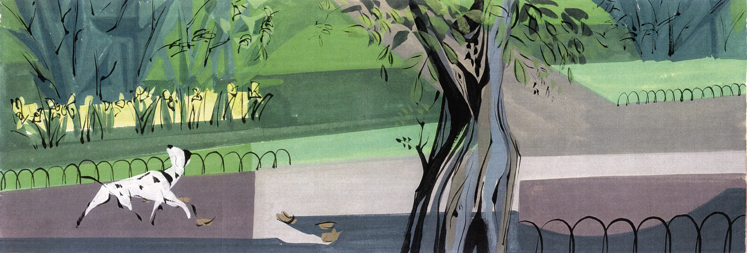
But more unique to Dalmatians was the way backgrounds blended stylistically with the animation.
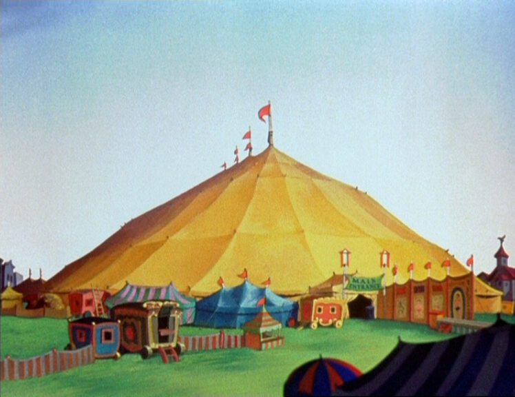
Up until then, if one excludes the first 5 or 8 years of shorts, Disney backgrounds used a lavish pictorial style. Sometimes, soft and simplified (Dumbo),
sometimes almost impressionistic (Bambi)
sometimes rich and detailed (Sleeping Beauty).
I always found a bit
strange that while the characters are stylized, (often rendered only through contours and
lines, shading mostly absent) the backgrounds, albeit not
REALISTIC, are rendered in a completely different technique.
In his essay Understanding Comics, Scott McCloud makes the point that this very choice is what makes Disney movies so accessible and yet so immersive. We can project ourselves far more easily in to simplified, stylized characters, but at the same times we "buy" their world because of the detail with which it is depicted.
For Scott McCloud, this technique is analog to what Japanese manga do (for instance, think of the contrast in Masamune Shirow's Appleseed, between the increasingly cartoony face of Deunan and the extremely detailed technology in the background)
But apparently this problem of "blending" characters and background together was something that bothered Walt Disney’s renaissance man Ken Anderson, who saw in the new xerox technique and in the contemporary setting of the movie an opportunity to experiment with a new style of backgrounds.
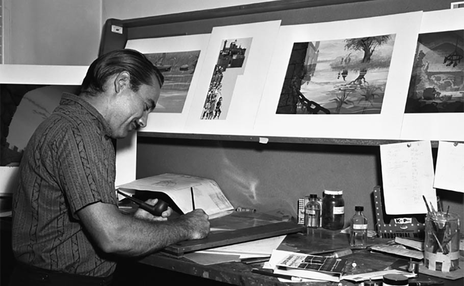
And here comes in Walt Peregoy.
A longtime collaborator of the studio, Peregoy was the color stylist for many Disney productions, and his contribution to Dalmatians cannot be understated.
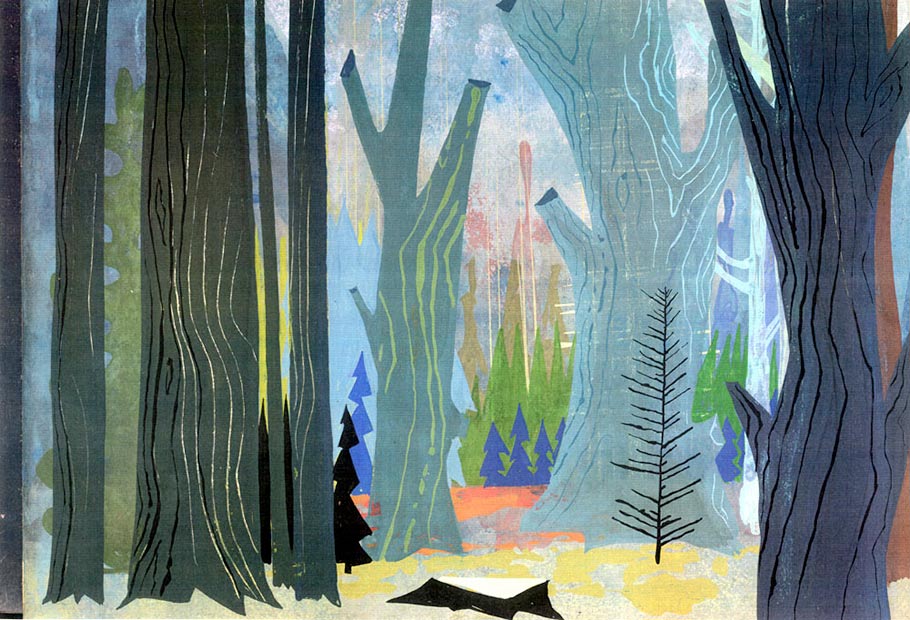
In the movie, the modernlystylized backgrounds by Ken Anderson and Ernie Nordli (slightly asymmetrical and tending to caricature) were superimposed over flat, almost abstract patches of color, with stunning results.
Background artists Al Dempster, Ralph Hulett, Anthony Rizzo & Bill Layne followed very closely the styling as dictated by Peregoy.
As Brad Bird points out in this video, this style is only deceptively simple.
It requires a great degree of draftsmanship, extreme color sensibility: the illustrator has to become a designer.
I've attempted (with little success) to apply some of these principles (textures, bleeding) to my own work.
I'll let you judge the results, but they are far from satisfactory.
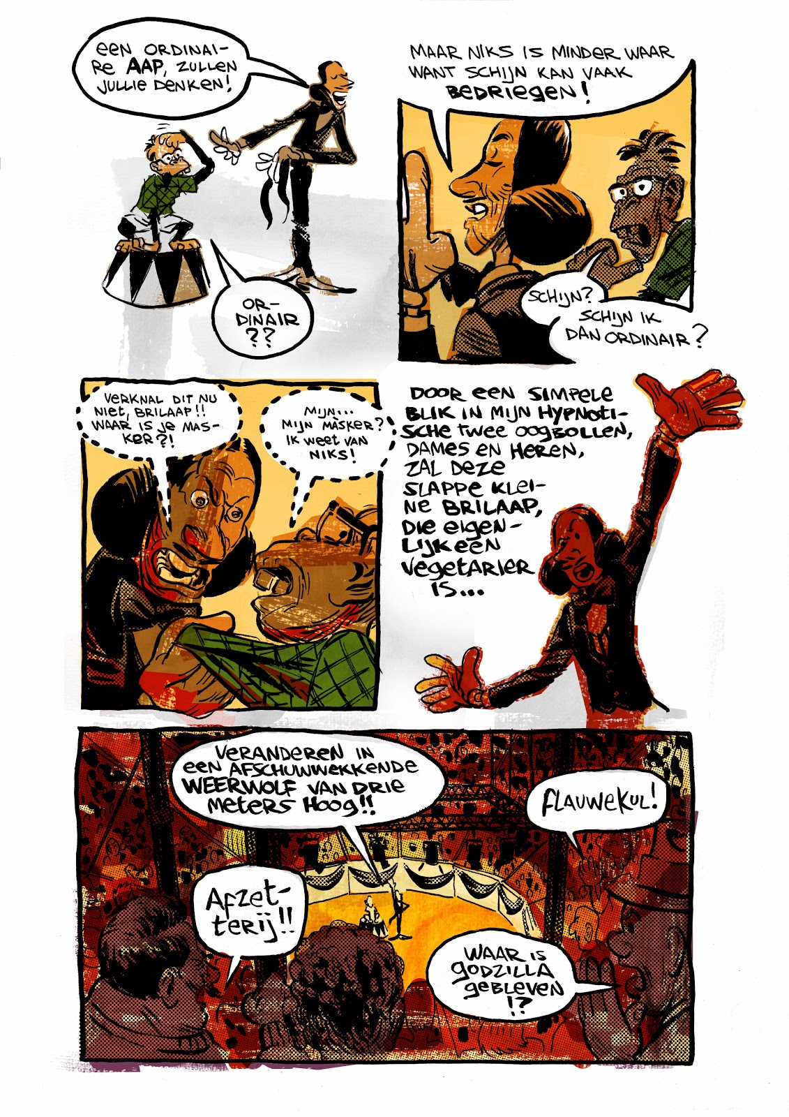
The only pride I have in this work is that I was able to deliver on schedule! (by basically giving up sleeping - which led to acute forgetfulness - which led to discovering I'm probably ADD anyway - which led to... oh, screw it. That's going to be my next post).
you can listen to a two-parter interview with Peregoy here
and here. (thanks to The Animation Guild blog)
***
In many ways the work of Peregoy (Anderson and Nordli) reminds me a lot of Mirosalv Sasek
And in more recent years i find the same qualities in Lou Romano's designs.
Somehow I guess my fondness for this style of design traces back to some books I used to have around the house when I was a kid.
In giro per il mondo con Disney (Around the world with Disney):
The book series Il Club delle Giovani Marmotte (Junior Woodchucks Club):
And the guidebooks called Il manuale delle giovani marmotte (Junior Woodchucks Guidebook), volumes 1 to 3:
These books were all illustrated by Italian Disney Maestro Giovan Battista Carpi.
As a kid I didn't particularly like his style, preferring the more modern Giorgio Cavazzano, Massimo De Vita or Stefano Intini, but when re-thinking years later about it, I must admit Carpi really had an incredible sense of design.
