Superman and Spider-Man is one of the first comic books I remember
owning and probably one of the first I have actually READ.
(I'm sure it was the first one my brother Maurizio has ever read, because I remember him taping his voice while reading it aloud, practicing his then newly acquired skill)
That comic was penciled by
John Buscema.
If you have been reading
Marvel comics from the late sixties through the early nineties, then you have
most certainly stumbled across his work, as he has been one of the pillars of
the "House of Ideas".
He did tons of penciling,
both as a regular as well as filling in when other artists could not deliver on
time; he provided lay-outs or panel breakdowns for countless books and left an
imprint on the Marvel house style second only to Jack Kirby's and possibly au
pair with John Romita Sr.
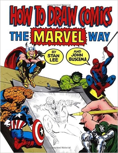
Not surprisingly he co-authored the How to Draw Comics Marvel Style book, a product not without its detractors, who see it as little more than a
gimmick, but still a good and fun entry point for young wanna-be cartoonists.
As a youngster I've never
paid particular attention to his work until I had the chance of getting in
touch with Claudio Castellini, a young but already accomplished
Italian comic book artist (probably my favorite back then) who made a splash
with a style greatly influenced by American cartoonists.
Castellini was gracious
enough to share some of his time with the 15-years-old me, back when I dreamed
of becoming a comic book artist.
I used to send him some
samples which we would then discuss a couple of weeks later over the phone.
(to this day, the notion of a busy professonal making time to chat over the phone with a teenage aspiring artist blows my mind)
Always encouraging and never once rude, Castellini, who displayed very silver age taste for realistic yet dynamic art, insisted time and time again that I learn anatomy.
No. That I MASTER anatomy.
So he recommended me to
study (even right down copy) Buscema's work as he thought no other artist was
more accomplished in the drawing of the human figure in motion.
Castellini himself picked up a couple of Buscema's mannerisms, like the "spades" feet (as I call them) and the frequent use of poses where one character would be leaning heavy on one leg, while keeping the other foot lifted from the ground.

In order to understand anatomy I also sank my teeth in Burne Hogarth's Dynamic Figure Drawing, a book that also had a palpable influence on Castellini.
(I may be misremembering this, since my appreciation of Hoghrath has diminished greatly, but I don't recall Castellini ever mentioning Hogarth, surely not nearly as much as Buscema)
(truth be told, he recommended also s to study actual photos of body builders, as "it doesn't get any more anatomical than
THAT")
(well, I guess it does in porn, but I digress...)
So I went on and bought some issues of The
Savage Sword of Conan.
They were terrible editions: downsized
to pocket book format, not in chronological order and with single stories often split across two issues.
But the art was great.
Buscema enjoyed Conan a lot more than "dudes in tights". Frank Miller even said he resented having to draw super-heroes, even though the quality of the work never betrayed any ill sentiment.
The inking on Savage Sword wasn't very consistent: it went from the
lavish etching-like inks of Alfredo Alcala, to the surely competent but less impressive finishings of Ernie Chan (a personal favourite of mine is Nestor Redondo's work on issue 90)
Buscema's hand can be seen all right through the
inking, but I would have liked more consistency.
As it appears, Buscema's pencils were never very
tight. Some even say he provided mere sketches, and that the inker had to do
much of the heavy lifting.
While it's true that at times he provided just
lay-outs and break-downs the looseness of these samples should not trick you:
there is so much going in every single line.
It is all there.
Even with little to no indication to where the
blacks should go, I promise you these are pages that leave only two ways to go to
the inker: the right way and the wrong way.
But the one thing we should celebrate Buscema for, it's anatomy.
Especially dynamic anatomy, or even better,
comic-book-dynamic anatomy.
The kind of human figure drawing that requires
knack for posing the characters and staging the action.
Only in recent years I finally realize the
wonderment of Castellini at Buscema.
Indeed, he never got it wrong.
There is no pose he would oppose, no angle he could
not handle.
The proportions are always spot on, the poses always plausible, yet they are never dull. His characters are expressive, dramatic, readable and appealing.
Yes, he was using shorthands and formulas, but let's not forget that the guy had to crank out pages at a ridiculous rate, I'm sure he did not even have the time to lookup for references, and that can explain why many characters share the same body type, why some of his "extras" tend to look alike, but this is beside the point.
He really could draw people in motion at a drop of
a hat.
Those "loose" pencils are a good measure
for his confidence and draftsmanship
There are many, many artists who have been compared
(rightly or wrongly) to Michelangelo and Buscema is among them.
I suppose the abundance of half-naked guys and gals in both artists' work makes the use that comparison even more
tempting.
But I won't disagree.
As you certainly should give a look to Michelangelo if you
want to master the human figure, then I also recommend as warmly to study Buscema
too.
Especially if you are into sequential art.


No comments:
Post a Comment