Tuesday, 4 December 2018

Roberto


I do not remeber the specifics, I believe it had to do with my Jorge Zaffino Google Gallery, but a few years back I got acquainted over the internet with artist Roberto Zaghi.

Born and raised in Ferrara (and sporting a decisively recognizable accent from that region) and now lving in my own native Milan, Roberto begun his apprenticeship as a cartoonist by accident.

Quite literally: he was involved in a motobike crash which left him badly injured. While convalescent, Roberto rekindled his interest in comics, which he had abandoned since childhood in favor of studying electronics and chemistry.

Once he re-started drawing (something he previously only did for his own pleasure) he never stopped again.

He had some fine menthors in Germano Bonazzi and Nicola Mari, both affirmed pro's in Italy's comic scene.

Beside his obvious talent and passion, Roberto must have an incredible work ethic that make him commit to the drawing board many hours a day. To me that shows not only in the volume of his output, but also in his evolution.


If one compares his earlier art, clearly influenced by Nicola Mari, with his latest pages, sketches and commissions, the evolution is remarkable.

Proof that talent without commitment is useless as a bicycle with no handle.


Roberto is also high on my list of favourites because he likes all the right stuff. He has a soft spot for a lot of the old masters who produced solid, realistic work with flare and panache (Leonard Starr, José Luis Garcia-Lopez and most of all Alex Toth, who I started appreciating thanks to Roberto).

For someone who loves Jorge Zaffino, Roberto has a surprisingly polished, clean style (which I admire a lot).

He is also a very generous person, who will always find the time to reply to a mail or a phone call or engaging in an excange on Facebook.

He appears to be very modest as well: his only goal is to illustrate the story in the best way possible, with the reader in mind and very little ego.

To me, he is the quintessential gentleman professional of popular comics.

You can admire his work at the following links:

http://robertozaghi.blogspot.com/

https://www.instagram.com/robertozaghi/

http://robertozaghi.tumblr.com/

Tuesday, 13 November 2018

Stan Lee 1922-2018

On November 12, 2018, Stan Lee, born Stanley Martin Lieber, passed away.

He almost made it to the 100 years mark.


I had the chance to meet Stan Lee in Lucca, twenty-five years ago, long before the main italian comic con became the "sponsored chinese sideshow" of today (copyright: Maurizio Caschetto).

He was promoting the Marvel 2099 line of comics and he talked to a relatively small but enthusiastic audience about how Marvel Comics were more scientifically sound than DC's. 


He used to love Superman, for instance, because in the beginning he could leap across great distances thanks to his superior strength, and that was somewhat acceptable.

But then he just flew, with no reason whatsoever.
Whereas Thor does not fly. Thor rotates his hammer until it has enough momentum, then throws it and just exploits the pull of the hammer to fly ("Now, THAT's scientific!" he would joke).

Or he would tell about how puzzled he was when his assistant informed him that some "Mr. Felony" was there to meet him and about his surprise when he discovered it was none other than italian film director Federico Fellini.


I was but an 8th grader and listened in awe.


When asking (and getting) his autograph, my dear friend Alessandro Minoggi and I showed him the opening splash-page of a Spidey story we made, in our first attempt to create proper comics (on decent artist's board and using rapidographs). He smiled and nodded approvingly, which made us feel like a million dollar.

To the 13-years-old me, the avuncular Stan Lee seemed rather grandfatherly and I would not have thought back then that a quarter century later he would still be such a felt a presence in comicdom.

He leaves behind a great legacy, albeit a problematic one.


His passing, curiously not much later than Spider-Man co-creator Steve Ditko's, signifies the definitive end of an era, although it probably won't shift much the conversation among fans and historians about who should get what credit for the creation of the characters and stories that, still to this day, constitute the foundations of the so-called Marvel Universe.


Monday, 17 September 2018

More caricatures


I've been enjoying making caricatures lately, and making them quick (sort of).


Tim Burton: motivated by the news of the upcoming exhibit in Genk, i sketched this one on my sketchpad and left it half-finished until a couple of days ago, where I've blown it up a little bit and touched it up, adding the 'big f***ing Jackie-O glasses' (cit: Kevin Smith)


Quick warm up sketch. of my friend and mentor Serge Baeken.

Yet another "farewell present", this time for a colleague. The most caricature-y I've done so far. I'm ok with it, yet I think the original sketch got the likeness slightly better.


The incomparable Alan Moore, after Milt Kahl's Merlin form Disney's "The Sword in the Stone".


Monday, 10 September 2018

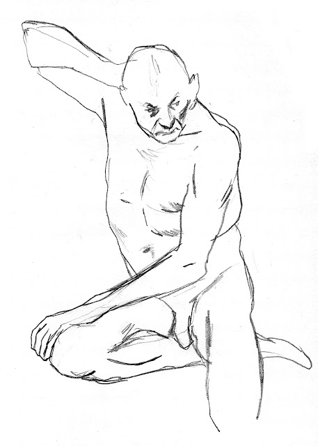
From life...


As a youngster I remember being frightened by any request to draw from life and I figure the feeling is shared among many of those who paint, draw or illustrate, even among professional. 


Drawing from life exposes the artist, more than the models.
Be it a portrait, or a full body pose, the work can be immediately compared to its real-life model by anyone passing by. Every onlooker can easily judge whether the likeness has been got.
The portrayed might react badly if the portrait is not accurate (or flattering) enough.


Drawing from life implicates that you are not alone. You won't be judged only by the result, but also by how long it will take you and by how you approach the task at hand.


But in time, drawing from life became one of my favourite occupations.


Being a staple of any traditional (and I dare say serious) art curriculum, schools, academies and other educational venues organise life sessions.
But since I left school I had little opportunities to have people pose for me (and I never dare asking, fearing I would sound cheeky).

So, when I found out that life sessions were regularly organised by Serge Baeken in Antwerp for people who cannot afford private sessions with models, I made sure to participate as often as I could (which is not nearly as much as I would like to).

Serge's sessions are great and particularly attuned to my sensibilities.
The posing times are short (5, 10, 15 minutes) which are great for people like me who mostly like to sketch and outline the drawing rather than work on rendering highlights and shadows.
Short posing times allow also to ask for more extreme poses, unsustainable for long stretches of time.

The illustration below were drawn during a different session with a different group, where poses are held for 30 minutes. The model chose of course more confortable positions.


But really, drawing from life can be done in any possible way. It is kind of addicting. So much so, that sometimes I draw from photographs with the same speed, urgency and approach.


Thursday, 23 August 2018

Writing lesson from Chuck Dixon


I wonder why I did not share this before.

I've already written extensively about by love for the late Argentinian artist JORGE ZAFFINO, whom I consider a true master of comics.

In the US, Zaffino worked at many reprises with writer Chuck Dixon, a veteran of american comics, with thousands of stories under his belt and mostly known as the writer who created Batman's villain Bane.

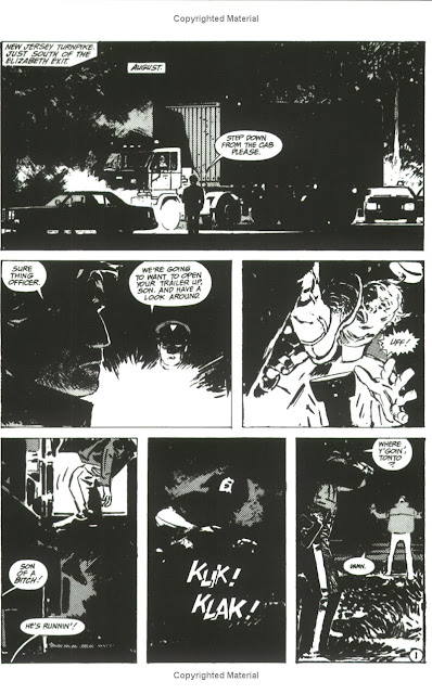
To me, the height of their collaboration was reached on the one-shot book Seven Block, first published for Epic, a now defunct Marvel Comics imprint for more mature, creator-owned material.


The book has been reprinted in black and white by IDW, but seems to be unfortunately out-of-print.


Like much of Dixon's output, it is basically a genre-piece, in this case horror (but Dixon is as well-versed in fantasy, action, adventure and more), but elevated by the impeccable execution of both script and art.


A necessary remark: for all the praise I have for the script, it must be said that the art is crucial nonetheless. The same script drawn by a lesser artist would be robbed of its power. Think of a great movie script badly acted or poorly directed.

When I re-read the book a few years back, I was surprised by the clarity in the storytelling; when I discovered that Dixon was reachable via his own website and via facebook, I got in touch and asked him a few questions specifically about this piece of work.

He was kind enough to answer, but until now I did not think of sharing this exchange with the rest of the world.


I think it provides some useful insights for storytellers and for anyone aspiring to a career in comics.


(note: The following text has been redacted in interview form for readability)


Q: Lately I've been studying Seven Block: would there be the chance to have look to the original script?

A: The original script was many, many hard drives ago. In fact, it may actually have been typewritten.

Q: I love Zaffino's art in it, but I've also noticed how well-paced it is: I've noticed most "sequences" fits neatly in one page and even when they are 2 or 3 pages long, the action is broken down so that every page has a strong dramatic unity. Did you work with that precise structure in mind and worked every scene until they reached the desired length?

A: I usually try to keep the dramatic beats to one page in any of my stories. I think it makes it easier to follow and allows me to avoid "Meanwhile back at the ranch" type captions. 
The reader unconsciously picks up on the rhythm and knows that a new scene may start when they turn the page. But each page ended on a suspenseful or dramatic note to draw the reader forward and make turning the page as irresistible as I could make it. And it was Jorge who turned those pages into the masterworks of comic art that they are. He always made me look like a genius. Jorge and I were very simpatico despite the language barrier. In the first draft of Seven Block I had the black doctor tell one of his compatriots to "go f--- himself". My editor felt this language was too strong so I removed the line and didn't provide a replacement. I simply had the doctor walk away without saying anything. That's the script that Jorge worked from. But when I got the finished art I was surprised to se that Jorge had drawn the doctor giving the finger as he walked away. He knew what the scene needed without knowing about the stricken line. 

Q: I love also how essential is the information you give to the reader. There is no use of captions, dialogue is straight to the point. With the sole exception of a dialogue between the two doctors at one point (necessary to download some info about the history and purpose of the experiment) there is no trace of expository dialogue. It sounds very casual and real. How you make sure there is enough for the reader to follow the plot?

A: My treatment of dialogue and plotting comes from studying the films of Howard Hawks. Each of his movies, regardless of genre, seems to flow effortlessly from event to event without the sense that there is a creative hand guiding everything. His dialogue rarely speaks of the plot yet informs us about character in a way that keeps the story clear and progressing. It wasn't until I read his biography that I learned that none of these things were accidents. Hawks worked very hard to conceal the fact that he was telling a story and allowed events to proceed as naturally as possible from scene to scene. Most scenes would serve at least two purposes and there was never a wasted moment.


Thursday, 16 August 2018

Re-blog: The Other Stan Lee: Not giving Credit where it’s due!

This is a great piece by blogger and comic Book historian Barry Pearl about one of comic book history hottest and most debated topics: who created the Marvel Universe?

https://forbushman.blogspot.com/2018/08/the-other-stan-lee-not-giving-credit.html

The article does not unearth any new document, but it is based only on available material, but puts it in perspective.

On the same topic and researched with the same care are Alex Grand's videos created for comicbookhistorians.com


Monday, 16 July 2018

More Spielberg and Rockwell


In a shadowy studio, an unimpressive looking man is painting a self-portrait, looking at his reflection in a mirror to better capture his own features .
The man is quiet and seems alost indifferent to this activity.

This is the opening of Bridge of Spies, a political thriller directed by Steven Speilberg.

The man is Abel, and he is a spy (even though, the character never admits being one).


This opening image asks: who is the real Abel? Which one is only a reflection? Which one is just a depiction?

Talking about the film, my brother Maurizio pointed out to me how much this first visual is reminiscent of the famous "Triple self-portrait" by Norman Rockwell.


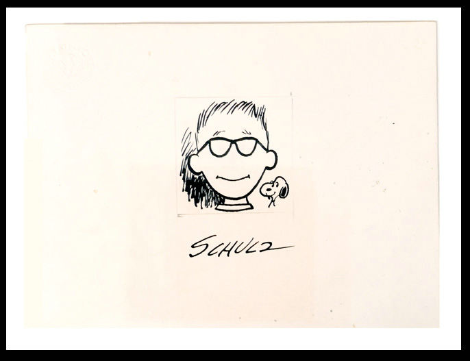
In the painting, Rockwell presents three versions of himself. Painted on the canvas is the suave, knowing Norman Rockwell. With the pipe securely held between the slightly smiling lips, the portrait suggests confidence. But in the mirror Rockwell looks far less secure. His pipe hangs downwards and a reflection on his spectacles (absent in the portrait with the portrait) blanks out the eyes, suggesting even more cluelessness (something that reminds me of the "featurelessness" of another self portrait of an American artist: Charles M. Schultz)


This multiplicity expressed by Rockwell is absent in its visual equivalent in Bridge of Spies, but implied in its narrative: who is Abel really?

Steven Spielberg is both a fan and a collector of Rockwell's work (and trustee emeritus at the Rockwell Museum, MA), so it is not surprising that Rockwell-inspired images crop up in his work.

For instance, this iconic moment in Schindler's List...


... stems from the very well known "The Problem We All Live With".


Spielberg himself is on the record saying that many images in E.T. were inspired by Rockwell, although I cannot find some direct evidence.

The oldest direct quote I was able to trace comes from The Empire of the Sun (1987), based on the novel by J.G. Ballard.

At first this quote stroke me as incongruent. Why a movie based on the memoirs of a British kid in Shanghai would be a good place to reference an American painting? Apart form the time period I could see no connection.


But at closer inspection the 1941 painting, called "Freedom from Fear", which is part of a series of four, reveals its thematic resonance with the movie.
The headline on the paper in the painting contains the word "BOMB", which, unbeknownst to Rockwell, will take new meaning when "THE bomb" will be dropped on Hiroshima in 1945 (that very event also plays an important role in the movie's third act).

That is what i like about Spielberg's adoption of Rockwell's imagery: he's not making literal quotations for the sake of it, but rather borrowing Rockwell's strong visual language to explore similar thematic material, be it identity, intolerance, a safe shelter in wartime.

It is a different approach than Zemeckis', whose quotation were more direct because the intention was to evoke a precise era and its feeling (in this sense, the quotations in Forrest Gump serve the same purpose as the pop-hits featured in the soundtrack).

One last quote is from Spielberg's penultimate movie to-date, The Post.

Spielberg stages a scene with a woman pressured (or advised) by men...


...just like Rockwell did in his "Jury Room" (1959)...


... which was most likely inspired either by the teleplay 12 Angry Men (1954), or by its movie adaptation of 1957.


And in this game of mirrors, quotations and deceit, 
Rockwell's "Jury Room" has apparently seeped out of the realm of fiction in to our reality: this picture has been taken during the last G7 summit.


It's a sad realization, when your world looks like a Bizzarro version of a Rockwell's painting.
(again: thanks to my brother to point out this last connection).


Thursday, 12 July 2018

Zemeckis, Spielberg, Lucas and Norman Rockwell

The work of  Norman Rockwell had a very important influence on Robert Zemeckis' 1994 classic Forrset Gump.

I wanted to link an interview with a direct quote to support the claim, but I cannot find a specific an contextualized statement, so take my word for it.

But I think it's pretty evident.

The most overt visual quote is probably this one:

Image result for forrest gump  rockwell

being clearly influenced by the 1953 painting "Outside the Principal's Office"

Image result for outside principal's office rockwell


(it has been admitted by the filmmakers: check out Zemeckis and producer Steve Starkey's audio commentary on Forrest Gump's DVD).

But it does not stop there.


For instance, to me Forrest's very appearance is very reminiscent of Rockwell's beloved "Breaking Home Ties": notice the similar haircut and the subtle use of the U.S. flag colors in both images.


And even when not quoting directly any painting, some scenes have a very rockwellesque feel to them.

Related image


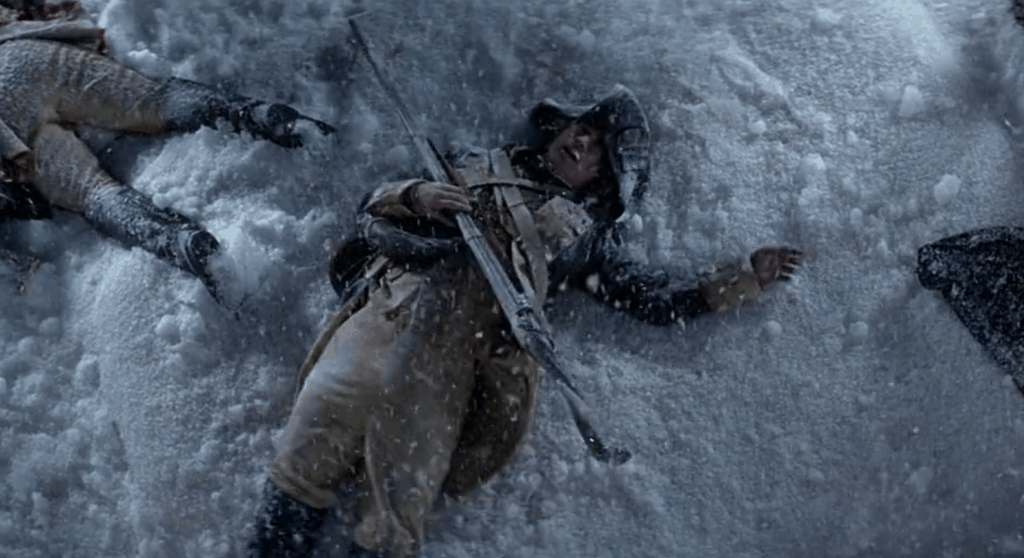
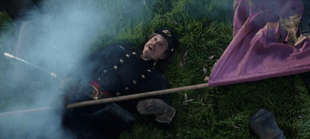
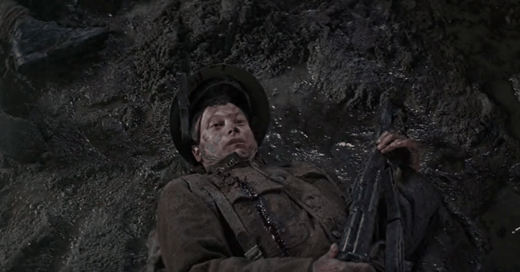
I also think that the way the character of Lieutenant Dan (last descendant to a long line of soldiers) is introduced hearkens back to the many paintings of the fighting Gillies, a fictional dynasty of all-american patriots.


Image result for thefighting gillies


Although admittedly, Zemeckis' take on patriotism is a little more satirical and makes for a funnier visual gag.

Image result for lt dan forrest gump every single american war quote

Image result for lt dan forrest gump every single american war quote

Image result for lt dan forrest gump every single american war quote

Image result for lt dan forrest gump every single american war quote

https://youtu.be/gh2DzGccvJc?t=2m44s

Rockwell has been criticized both for his sentimentality and for his stubborn dedication to realism. Even when compared to other commercial illustrators working in a realistic style, his work has been dismissed as stale, or lacking grit and vitality.

I do not share those feelings. Even putting aside the sheer draftsmanship he possessed, and uncanny ability to depict human reactions, he was incredibly skilled in the art of STAGING a picture.

He took his job as an ILLUSTRATOR quite seriously, and the way he chose the colors, the lighting, the framing, the props, the faces was meticulously crafted and arranged (and THAT takes skill) with the reader in mind.

He didn't not want you to appriciate the craft, he wanted you to immerse yourself in the scene.

Not surprisingly director Steven Speilberg is both a fan and a collector of rockwell's work and quoted it in several of his movies as well.

Like Rockwell, Spielberg is an absolute virtuoso in his field. The staging an camera work in his movies are among the best in the business, but they are NEVER meant to be noticed. Spielberg does not want you to admire his technical prowess, he wants you to buy in to the story.

Rockwell is also far less cheesy than he's often accused of being. While at a first glance there seems to be a directness to the stories they are telling, there is a surprising amount of ambiguity and  "openness" to them.

They could make for some interesting material in a thematic apperception projective test, and the different takes different people may have at many of them could be surprising.

What is unmistakable is Rockwell feeling for the humane and his lack of cynicism.

Rather tellingly, Rockwell collaboration with the Saturday Evening Post coincided with the shooting of president Kennedy in November 1963.


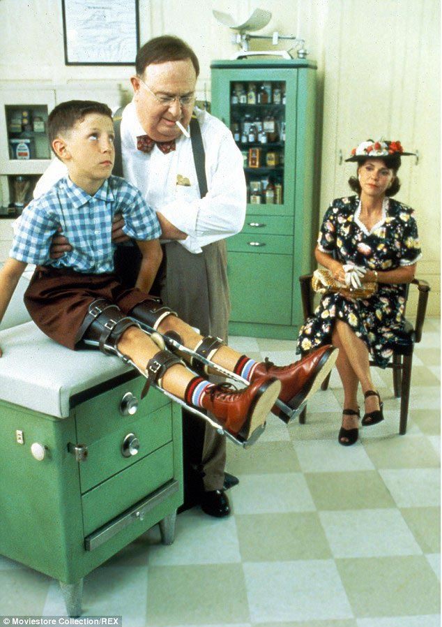
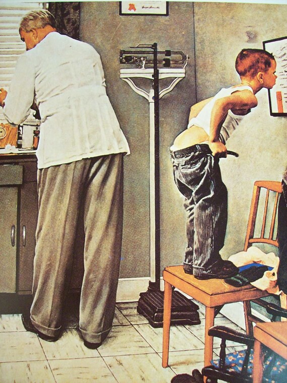
Image result for forrest gump doctor rockwell


Check out this video where Spielberg and George Lucas explain their fascination with Rockwell:


Other pages worth checking:

https://indianapublicmedia.org/arts/breaking-home-ties-sketch-masterpiece/

https://paintinglifestories.blogspot.com/2013/10/the-two-norman-rockwells.html