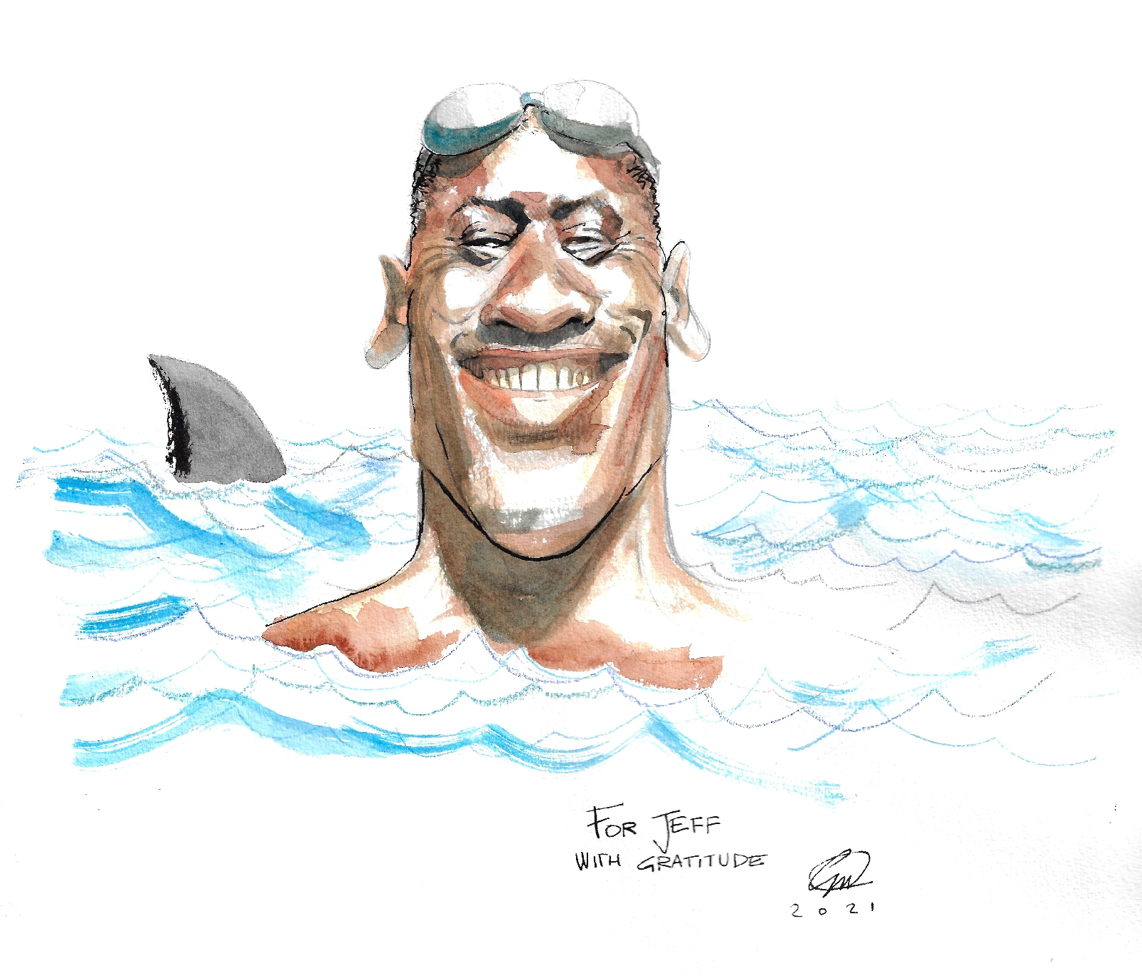
Portrait of swimmer (and John Williams fan) Jeff Commings, with whom I've had the pleasure of hosting three episodes of The Baton podcast, available here:
I really look up to Jeff: besides being a professional athlete (which is already commenadble for the discipline and dedication required, let alone the stamina) and a teacher, he's incredibly polite, articulated, intelligent, brave and entreprising.
Today's piece is a portrait of conductor Brett Mitchell.
Brett currently serves music director of the Colorado Symphony, and his resume is pretty impressive.
What put him on my radar was a podcast about the music of Star Wars, I've written about here.
Maurizio, who is currenlty doing a splendid job at thelegacyofjohnwilliams.com, got in touch with him, so we decided to present him with this tittle loving tribute.
Here's a couople of lovely video's of Brett playing John Williams on the piano
I'm not going to discuss any of the alligations and accusations directed at Mr. Allen here and their impact on the legacy of this prolific writer/comedian/director. I'm not informed nor is this relevant to this post. It's just that in my recent interest in caricatures I came across the work of very different, yet all very talented artist and I wanted to compare their styles based on the same subject. With his attitude and features, Woody Allen has created something of a modern "Maschera da Commedia dell'Arte", and this gave a lot of latitude to caricaturists.
The first in our series is Jack Davis, renowed and prolific illustrator from the 50sto the 2000s. Active in comics (various EC and warren titles, not to mention MAD MAgazine) advertising, movie posters and more, Jack Davis has been possibly the most famous "big feet" artist for decades.
This is a detail from his poster from Allen's Bananas.
As much as I love Davis, I have to say his take on allen is possibly the weakest of the bunch. I'm not diminishing his work at all, Jack Davis had a knack for posters and humourous illustrations for sure ans d his works exude personality. If anything, Davis' personality is coming maybe too strongly across. It is almost like he drew a JAck Davis character that appears to share some feature with Woody Allen (the thick rimmed spectacles, the unkempt hair, the long nose). Akin in style to Jack Davis, but arguably more gifted a portraitist is Mort Drucker.
Hard to pick one out from the two, but I'd go for Drucker for this reason. This ensemble portrait gallery is clear evidence of that.
Mort Drucker
Another well known caricaturist is David Levine, whose pen-and-ink crosshatching is reminiscent of satirical prints of older centuries.
David Levine
Differently from Davis and Drucker, Levine's characters do not have to live in an environment or to interact much with other people, props or background. therefore the artist can have a lot of liberty with proportions and with the degree of detail he wants to put in to it. And to the opposite side of the spectrum, we have Al Hirshfield, to this day possibly one of the classiest and most refined charicaturists of the twentieth century. Hirshfield worked hard to distill the essence of his subjects in a few, elegant lines.
Jack Davis
This tradition of of great stylisation is still alive today, thanks to artists like the argentinian Pablo Lobato, and his amazing poppy and yet constructivist portraits.
Pablo Lobato
But comics can do stylization too. Check out how Woody Allen, who has been the subject of a syndacated stryp for quite some time, has been synthetized to a few pen strokes by cartoonist Stuart Hample.
I've been enjoying making caricatures lately, and making them quick (sort of).
Tim Burton: motivated by the news of the upcoming exhibit in Genk, i sketched this one on my sketchpad and left it half-finished until a couple of days ago, where I've blown it up a little bit and touched it up, adding the 'big f***ing Jackie-O glasses' (cit: Kevin Smith)
Quick warm up sketch. of my friend and mentor Serge Baeken.
Yet another "farewell present", this time for a colleague. The most caricature-y I've done so far. I'm ok with it, yet I think the original sketch got the likeness slightly better.
The incomparable Alan Moore, after Milt Kahl's Merlin form Disney's "The Sword in the Stone".
As a youngster I remember being frightened by any request to draw from life and I figure the feeling is shared among many of those who paint, draw or illustrate, even among professional.
Drawing from life exposes the artist, more than the models. Be it a portrait, or a full body pose, the work can be immediately compared to its real-life model by anyone passing by. Every onlooker can easily judge whether the likeness has been got. The portrayed might react badly if the portrait is not accurate (or flattering) enough.
Drawing from life implicates that you are not alone. You won't be judged only by the result, but also by how long it will take you and by how you approach the task at hand.
But in time, drawing from life became one of my favourite occupations.
Being a staple of any traditional (and I dare say serious) art curriculum, schools, academies and other educational venues organise life sessions.
But since I left school I had little opportunities to have people pose for me (and I never dare asking, fearing I would sound cheeky).
So, when I found out that life sessions were regularly organised by Serge Baeken in Antwerp for people who cannot afford private sessions with models, I made sure to participate as often as I could (which is not nearly as much as I would like to).
Serge's sessions are great and particularly attuned to my sensibilities.
The posing times are short (5, 10, 15 minutes) which are great for people like me who mostly like to sketch and outline the drawing rather than work on rendering highlights and shadows.
Short posing times allow also to ask for more extreme poses, unsustainable for long stretches of time.
The illustration below were drawn during a different session with a different group, where poses are held for 30 minutes. The model chose of course more confortable positions.
But really, drawing from life can be done in any possible way. It is kind of addicting. So much so, that sometimes I draw from photographs with the same speed, urgency and approach.
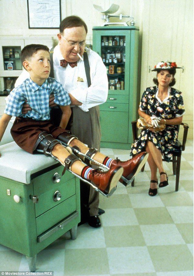
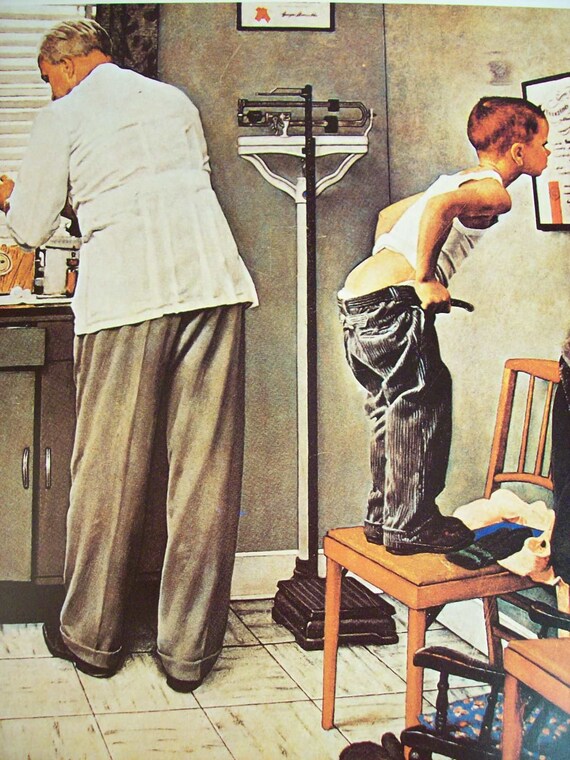
The work of Norman Rockwell had a very important influence on Robert Zemeckis' 1994 classic Forrset Gump. I wanted to link an interview with a direct quote to support the claim, but I cannot find a specific an contextualized statement, so take my word for it. But I think it's pretty evident. The most overt visual quote is probably this one: being clearly influenced by the 1953 painting "Outside the Principal's Office" (it has been admitted by the filmmakers: check out Zemeckis and producer Steve Starkey's audio commentary on Forrest Gump's DVD). But it does not stop there.
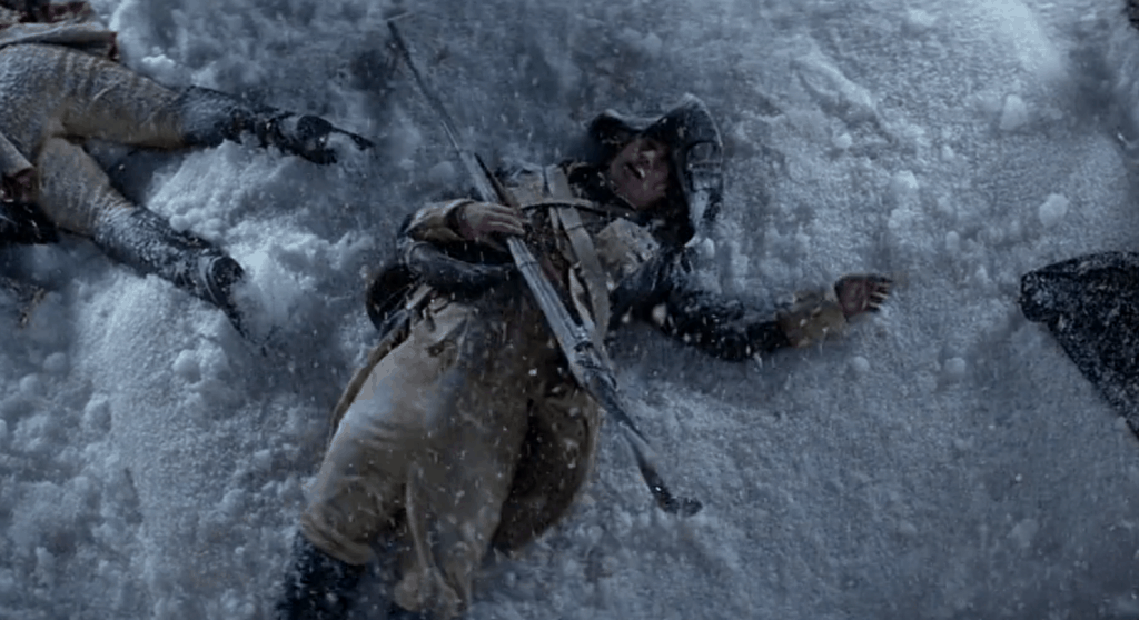
For instance, to me Forrest's very appearance is very reminiscent of Rockwell's beloved "Breaking Home Ties": notice the similar haircut and the subtle use of the U.S. flag colors in both images. And even when not quoting directly any painting, some scenes have a very rockwellesque feel to them. I also think that the way the character of Lieutenant Dan (last descendant to a long line of soldiers) is introduced hearkens back to the many paintings of the fighting Gillies, a fictional dynasty of all-american patriots. Although admittedly, Zemeckis' take on patriotism is a little more satirical and makes for a funnier visual gag. https://youtu.be/gh2DzGccvJc?t=2m44s Rockwell has been criticized both for his sentimentality and for his stubborn dedication to realism. Even when compared to other commercial illustrators working in a realistic style, his work has been dismissed as stale, or lacking grit and vitality. I do not share those feelings. Even putting aside the sheer draftsmanship he possessed, and uncanny ability to depict human reactions, he was incredibly skilled in the art of STAGING a picture. He took his job as an ILLUSTRATOR quite seriously, and the way he chose the colors, the lighting, the framing, the props, the faces was meticulously crafted and arranged (and THAT takes skill) with the reader in mind. He didn't not want you to appriciate the craft, he wanted you to immerse yourself in the scene. Not surprisingly director Steven Speilberg is both a fan and a collector of rockwell's work and quoted it in several of his movies as well. Like Rockwell, Spielberg is an absolute virtuoso in his field. The staging an camera work in his movies are among the best in the business, but they are NEVER meant to be noticed. Spielberg does not want you to admire his technical prowess, he wants you to buy in to the story. Rockwell is also far less cheesy than he's often accused of being. While at a first glance there seems to be a directness to the stories they are telling, there is a surprising amount of ambiguity and "openness" to them. They could make for some interesting material in a thematic apperception projective test, and the different takes different people may have at many of them could be surprising. What is unmistakable is Rockwell feeling for the humane and his lack of cynicism. Rather tellingly, Rockwell collaboration with the Saturday Evening Post coincided with the shooting of president Kennedy in November 1963. Check out this video where Spielberg and George Lucas explain their fascination with Rockwell:
The raison d'etre of this blog is still unclear to me.
The very little number of visits and reactions suggest this is nothing more than a message in a bottle, a "wafer offered to infinity" (or "endlessly offered", depending on how you translate this quote from the french movie Tous les Matins du Monde).
It looks like I'm still undecided about making this a place to share things I make, or things I discover or things I think.
A bit of all three, I suppose.
However, I had some fun with the following stuff I drew and I see no wrong in posting it here.
These are two group caricatures I did in the last 15 months for people leaving the parents council at my kid's school.
These were not meant to poke fun at them, but rather as an affectionate farewell present.
I looked to a lot of Mort Drucker to find inspiration, but he's on another planet. I would not even describe mine as real caricatures, but rather as slightly disproportioned portraits.
And since caricatures turned out to be quite fun, I took a shot to Harrison Ford, both young and old.
A few tips on how to approach caricatures are found on the website of MAD magazine's Tom Richmond, very recommended.
The next one is drawn after a from a photo by belgian photographer Sanne De Wilde. I'm kind of happy with the style. I love artist who can create a lot of texture and volume with biro.
This led to further caricature/pen experiments.
(good ol' Tim Burton needs extra work, even as a sketch is feels too inconclusive). And for last, something definitely cuter, once again, inspired by the amazing work of Sara Ogilvie. (This reminds me I'll dedicate one of the next post to women who inspire me).
Still swamped
by family and work obligation that keep me away from the drawing board, I try
to move things along anyway.
I had
plenty of story ideas, didn’t need a new one, but a friend of my challenged me
by passing me a short poem and challenging me to make a comic out of it.
I took the challenged
and scripted the thing in a couple of days.
I did some
preliminary sketching and now I’m off to the actual drawing.
Funny thing
is that the opening panel (that has now become the opening splash page) is the hardest
thing in the whole story.
So I’m
taking my time with it, not wanting to mess it up right off the start.
And of
course I’m already fearing the moment I’ll have to ink the mofo.
I’m a
pretty bad inker. My good friend Taiyo still satirizes me about it. And for a
reason.
I tried to
look at the masters to see what I can pick from them, but still I felt very
much like a guy on a first date as described by Louis CK: “A blind dick in
space, thrusting into infinite directions”.
And it’s
not that I don’t know what style I want to work with (which is a problem, but a
problem I do not want to solve by just picking one style and sticking to it,
but rather through sheer perseverance to find MY style).
It’s that I
don’t know what I’m doing when I ink. Am I tracing? Am I drawing? Am I
improvising?
I often thought
it was the pencils. Should they be tight? OR not? It’s the pen or brush I’m
using?
So I sat
down. And started to think.
And suddenly
I think I have it.
It’s about
RENDERING.
The comic
art I grew up on and I still love, it’s as much a product of the artists as it
is a product of the limitation of reproduction techniques (and I’m no longer talking
about vision-challenged genitalia).
The solid
black line art so typical of comics was dictated by the inadequate printing tools and the poor paper
used for comic books and newspapers for many decades.
Because of
this, artists had to develop this specific graphical language that could suggest reality. Out of this necessity a sort of “grammar of the lines” was born, a grammar stillin use today.
This "grammar" was further advanced by the fact that comic books were printed in colors. Cross hatching, dry brushing and other visual devices were no longer used to represent different tones. This solid-black-lines-based style emphasize CONTOURS rather then TONE VALUES and somehow cemented in my mind the idea that LINES were the fundation of the art. .
Well,
WRONG.
IT IS ALL ABOUT RENDERING.
I've written it large and centered, so I won't forget it. I should put it on a cue card and place it above my desk. Of course there are a whole lotta elements that need be there in an illustration or a panel: composition, anatomy, body language, use of negative space and so on.
Cartoonists should better be good at a LOT of things that do not always come together.
But when time comes to finish an illustration, rendering is vital.
Hair, tone, textures, reliefs, clothing. The ink drawing has to suggest the tone, rather than draw the contour.
So I have come up with 4 tips, four exercises for myself first, but hopefully for anyone who may be struggling with inking.
1) Practice ALLA PRIMA ink drawings.
Either copying other artists' stuff, or photographs, or out of your own head, practice drawing with no pencil drawing or sketch underneath (maybe just a few marks to get the proportions right).
This should help developing this skills
a) build up confidence, which usually translates in fresher, more appealing drawings
b) train you to think in terms of final inked art.
2) Copy the artists you like the most and whom you consider the best inkers IN PENCILS
Since my issue in particular with pencils art that does not instruct or even suggest much about the actual final inked rendering, I decided to do some reverse engineering and train myself to think in terms of final art FROM THE PENCILING STAGE.
Make the pencil pass not only about getting the proportions, the pose, the expressions right, but be mindful of what the final art will need.
3) Shamelessy rip-off shorthand ways to do stuff.
My shortcomings as an inker come across more blatantly with some aspects rather than others.
One way around this is locating those problem areas (rendering of hair, thickness of contour lines, placement of shadows) and JUST COPY SOLUTIONS from artists you think solve those problems brilliantly.
This approach in general can be applied to a lot of other aspects, not only the inks, but layouts as well.
I do not see much disgrace in borrowing or even stealing solutions from the masters. There is a downside, though: this way you do not think about how the artist came up with his/her shorthand way of rendering something in the first place. And lack of knowledge or awareness usually translates in poorer art and will limit your range when faced with a new problem you cannot find a solution for in one of your masters' ouvre.
4) Don't do anything.
Which seems pretty much a in contradiction with what I just written, but stay with me for a second will ya?
While my inking has been mocked since those distant school days, my skills as a draftsman received some praise. This is not the place to brag or even defend my work, but I think it's safe to assume I have some skills and that my sketches do have some value.
Since modern technology does no longer require inking in solid black and white, why bother? Why not just use the techniques I'm most comfortable with OR just do with INK what I do with pencils or any other tool, without the urge to learn how to render?
Play to my strengths.
I should give this a try.
I suppose I just need practice and that improvements will come as a result of all of the above.
I'm not certain this long rambling made any sense to anyone other than myself, but I really needed to put it down.
Here below some links.
this tutorial is so far one of the best I've ever found.
Even the greatest masters are often unable to deconstruct and rationalize about their own processes, making art teaching a very rare skill
MAD illustrator Tom Richmond has the ability to break it down in a very accessible and straightforward language and deals with the "pressure" element of inking with actual ink (the irreversibility of the process makes it often a bit scary) using tools like brushes and quills which we do not use much in "real life".
It is not like taking a class or practicing, but it provides some very good insights.
The following tutorial by Joe Kubert suffers from some of the flaws I was writing about: Kubert is not breaking down HOW he does it, but even only watching a master at work is of some help.
Two of my favorite people (among those I don't know personally) in two excerpts from an evening held at the Connecticut Forum in 2012.
Nothing to do with comics, but I really enjoy listening to the two Neils talking. They have the rare gift of being articulate, precise but not overly verbose.