Showing posts with label comic book artist. Show all posts

Tuesday, 23 January 2018

John Buscema - The Anatomy Lessons


I've been familiar with the name and the work of John Buscema since a very early age.
Superman and Spider-Man is one of the first comic books I remember owning and probably one of the first I have actually READ.


(I'm sure it was the first one my brother Maurizio has ever read, because I remember him taping his voice while  reading it aloud, practicing his then newly acquired skill)

That comic was penciled by John Buscema.

If you have been reading Marvel comics from the late sixties through the early nineties, then you have most certainly stumbled across his work, as he has been one of the pillars of the "House of Ideas".
He did tons of penciling, both as a regular as well as filling in when other artists could not deliver on time; he provided lay-outs or panel breakdowns for countless books and left an imprint on the Marvel house style second only to Jack Kirby's and possibly au pair with John Romita Sr.


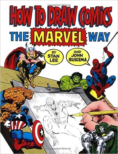
Not surprisingly he co-authored the How to Draw Comics Marvel Style book, a product not without its detractors, who see it as little more than a gimmick, but still a good and fun entry point for young wanna-be cartoonists.
As a youngster I've never paid particular attention to his work until I had the chance of getting in touch with Claudio Castellini, a young but already accomplished Italian comic book artist (probably my favorite back then) who made a splash with a style greatly influenced by American cartoonists.
Castellini was gracious enough to share some of his time with the 15-years-old me, back when I dreamed of becoming a comic book artist.

I used to send him some samples which we would then discuss a couple of weeks later over the phone.

(to this day, the notion of a busy professonal making time to chat over the phone with a teenage aspiring artist blows my mind)

Always encouraging and never once rude, Castellini, who displayed very silver age taste for realistic yet dynamic art, insisted time and time again that I learn anatomy.
No. That I MASTER anatomy.

So he recommended me to study (even right down copy) Buscema's work as he thought no other artist was more accomplished in the drawing of the human figure in motion.


Castellini himself picked up a couple of Buscema's mannerisms, like the "spades" feet (as I call them) and the frequent use of poses where one character would be leaning heavy on one leg, while keeping the other foot lifted from the ground.


In order to understand anatomy I also sank my teeth in Burne Hogarth's Dynamic Figure Drawing, a book that also had a palpable influence on Castellini.

(I may be misremembering this, since my appreciation of Hoghrath has diminished greatly, but I don't recall Castellini ever mentioning Hogarth, surely not nearly as much as Buscema)

(truth be told, he recommended also s to study actual photos of body builders, as "it doesn't get any more anatomical than THAT")

(well, I guess it does in porn, but I digress...)

So I went on and bought some issues of The Savage Sword of Conan.
They were terrible editions: downsized to pocket book format, not in chronological order and with single stories often split across two issues.

But the art was great.

Buscema enjoyed Conan a lot more than "dudes in tights". Frank Miller even said he resented having to draw super-heroes, even though the quality of the work never betrayed any ill sentiment.

The inking on Savage Sword wasn't very consistent: it went from the lavish etching-like inks of Alfredo Alcala, to the surely competent but less impressive finishings of Ernie Chan (a personal favourite of mine is Nestor Redondo's work on issue 90)

Buscema's hand can be seen all right through the inking, but I would have liked more consistency.

As it appears, Buscema's pencils were never very tight. Some even say he provided mere sketches, and that the inker had to do much of the heavy lifting.


While it's true that at times he provided just lay-outs and break-downs the looseness of these samples should not trick you: there is so much going in every single line.

It is all there.

Even with little to no indication to where the blacks should go, I promise you these are pages that leave only two ways to go to the inker: the right way and the wrong way.

But the one thing we should celebrate Buscema for, it's anatomy.
Especially dynamic anatomy, or even better, comic-book-dynamic anatomy.
The kind of human figure drawing that requires knack for posing the characters and staging the action.
Only in recent years I finally realize the wonderment of Castellini at Buscema.


Indeed, he never got it wrong.
There is no pose he would oppose, no angle he could not handle.


The proportions are always spot on, the poses always plausible, yet they are never dull. His characters are expressive, dramatic, readable and appealing.


Yes, he was using shorthands and formulas, but let's not forget that the guy had to crank out pages at a ridiculous rate, I'm sure he did not even have the time to lookup for references, and that can explain why many characters share the same body type, why some of his "extras" tend to look alike, but this is beside the point.

He really could draw people in motion at a drop of a hat.
Those "loose" pencils are a good measure for his confidence and draftsmanship 

There are many, many artists who have been compared (rightly or wrongly) to Michelangelo and Buscema is among them.

I suppose the abundance of half-naked guys and gals in both artists' work makes the use that comparison even more tempting.

But I won't disagree.

As you certainly should give a look to Michelangelo if you want to master the human figure, then I also recommend as warmly to study Buscema too.

Especially if you are into sequential art.

Friday, 8 April 2016

A long essay about INKING

Still swamped by family and work obligation that keep me away from the drawing board, I try to move things along anyway.

I had plenty of story ideas, didn’t need a new one, but a friend of my challenged me by passing me a short poem and challenging me to make a comic out of it.

I took the challenged and scripted the thing in a couple of days.

I did some preliminary sketching and now I’m off to the actual drawing.
Funny thing is that the opening panel (that has now become the opening splash page) is the hardest thing in the whole story.

So I’m taking my time with it, not wanting to mess it up right off the start.

And of course I’m already fearing the moment I’ll have to ink the mofo.

I’m a pretty bad inker. My good friend Taiyo still satirizes me about it. And for a reason.

I tried to look at the masters to see what I can pick from them, but still I felt very much like a guy on a first date as described by Louis CK: “A blind dick in space, thrusting into infinite directions”.

And it’s not that I don’t know what style I want to work with (which is a problem, but a problem I do not want to solve by just picking one style and sticking to it, but rather through sheer perseverance to find MY style).

It’s that I don’t know what I’m doing when I ink. Am I tracing? Am I drawing? Am I improvising?

I often thought it was the pencils. Should they be tight? OR not? It’s the pen or brush I’m using?

So I sat down. And started to think.

And suddenly I think I have it.

It’s about RENDERING.

The comic art I grew up on and I still love, it’s as much a product of the artists as it is a product of the limitation of reproduction techniques (and I’m no longer talking about vision-challenged genitalia).

The solid black line art so typical of comics was dictated by the inadequate printing tools and the poor paper used for comic books and newspapers for many decades.

Because of this, artists had to develop this specific graphical language that could suggest reality.
Out of this necessity a sort of “grammar of the lines” was born, a grammar stillin use today.

This "grammar" was further advanced by the fact that comic books were printed in colors. Cross hatching, dry brushing and other visual devices were no longer used to represent different tones. This solid-black-lines-based style emphasize CONTOURS rather then TONE VALUES and somehow cemented in my mind the idea that LINES were the fundation of the art.
.
Well, WRONG.

 IT IS ALL ABOUT RENDERING.

I've written it large and centered, so I won't forget it.
I should put it on a cue card and place it above my desk.

Of course there are a whole lotta elements that need be there in an illustration or a panel: composition, anatomy, body language, use of negative space and so on.

Cartoonists should better be good at a LOT of things that do not always come together.

But when time comes to finish an illustration, rendering is vital.

Hair, tone, textures, reliefs, clothing. The ink drawing has to suggest the tone, rather than draw the contour.

So I have come up with 4 tips, four exercises for myself first, but hopefully for anyone who may be struggling with inking.

1) Practice ALLA PRIMA ink drawings.
Either copying other artists' stuff, or photographs, or out of your own head, practice drawing with no pencil drawing or sketch underneath (maybe just a few marks to get the proportions right).
This should help developing this skills
a) build up confidence, which usually translates in fresher, more appealing drawings
b) train you to think in terms of final inked art.

2) Copy the artists you like the most and whom you consider the best inkers IN PENCILS
Since my issue in particular with pencils art that does not instruct or even suggest much about the actual final inked rendering, I decided to do some reverse engineering and train myself to think in terms of final art FROM THE PENCILING STAGE.
Make the pencil pass not only about getting the proportions, the pose, the expressions right, but be mindful of what the final art will need.

3) Shamelessy rip-off shorthand ways to do stuff.
My shortcomings as an inker come across more blatantly with some aspects rather than others.
One way around this is locating those problem areas (rendering of hair, thickness of contour lines, placement of shadows) and JUST COPY SOLUTIONS from artists you think solve those problems brilliantly.
This approach in general can be applied to a lot of other aspects, not only the inks, but layouts as well.
I do not see much disgrace in borrowing or even stealing solutions from the masters. There is a downside, though: this way you do not think about how the artist came up with his/her shorthand way of rendering something in the first place. And lack of knowledge or awareness usually translates in poorer art and will limit your range when faced with a new problem you cannot find a solution for in one of your masters' ouvre.

4) Don't do anything.
Which seems pretty much a in contradiction with what I just written, but stay with me for a second will ya?
While my inking has been mocked since those distant school days, my skills as a draftsman received some praise. This is not the place to brag or even defend my work, but I think it's safe to assume I have some skills and that my sketches do have some value.
Since modern technology does no longer require inking in solid black and white, why bother? Why not just use the techniques I'm most comfortable with OR just do with INK what I do with pencils or any other tool, without the urge to learn how to render?
Play to my strengths.

I should give this a try.

I suppose I just need practice and that improvements will come as a result of all of the above.

I'm not certain this long rambling made any sense to anyone other than myself, but I really needed to put it down.

Here below some links.

this tutorial is so far one of the best I've ever found.
Even the greatest masters are often unable to deconstruct and rationalize about their own processes, making art teaching a very rare skill
MAD illustrator Tom Richmond has the ability to break it down in a very accessible and straightforward language and deals with the "pressure" element of inking with actual ink (the irreversibility of the process makes it often a bit scary) using tools like brushes and quills which we do not use much in "real life".

http://www.tomrichmond.com/2006/08/21/inking-tutorial-part-i/
http://www.tomrichmond.com/2006/08/22/inking-tutorial-part-ii/

It is not like taking a class or practicing, but it provides some very good insights.

The following tutorial by Joe Kubert suffers from some of the flaws I was writing about: Kubert is not breaking down HOW he does it, but even only watching a master at work is of some help.


Comic Books Youtube Bonanza

It looks like the only thing left about the internet I still enjoy is browsing through YouTube looking for insightful video or audio documentaries.

here are some about comics:


Monday, 23 February 2015

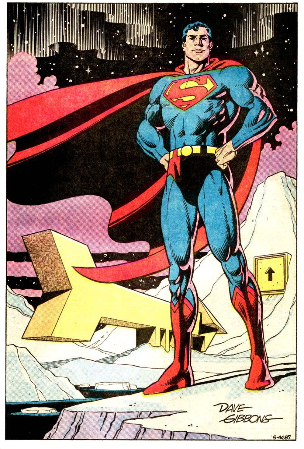
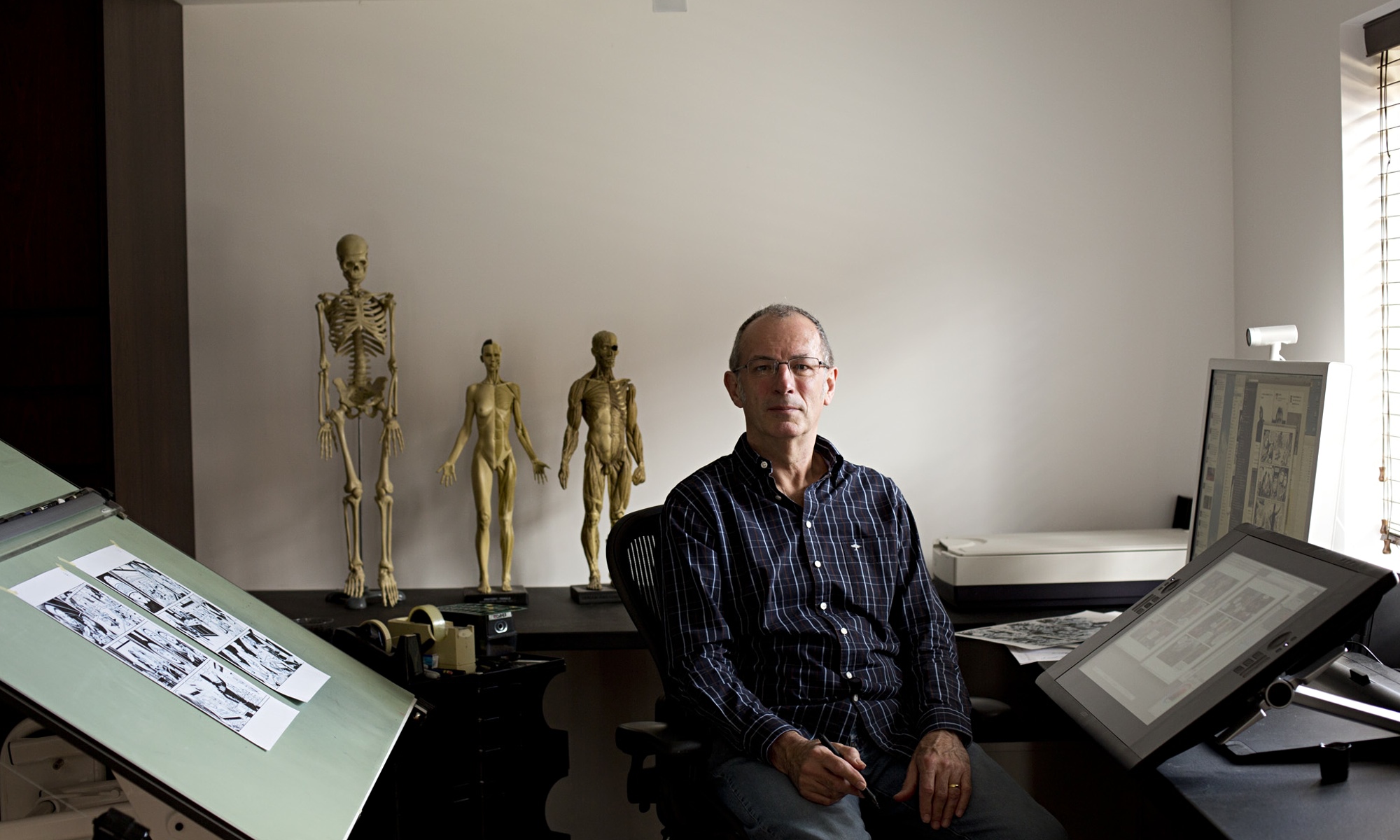
Dave Gibbons


Dave Gibbons needs no introductions: co-author of the seminal WATCHMEN and frequent collaborator of Northampton's scribe Alan Moore, Dave Gibbons is on of the most complete artists working in mainstream comics: penciller, inker, writer letterer, you name it.
His graphic style is a perfect blend of the american and european traditions.

I do not love his style viscerally as I do with other artists, but on some stories it just works perfectly.

There is undoubtly a staggering level of craft and we can all learn from his details and uncompromising technique.

He's also one of the most articulated people working in the field, no it is no surprise that this conversation with Bleeding Cool's Chris Thompson is very enjoyable to listen.

Of course, the reason for him to be interviewed at this particular time is the release of a movie based on a graphic novel he worked on (Kingsman - The Secret Service), so there you have it again: comics getting second-rated by movies.

But still...


Wednesday, 31 July 2013

Coming up: STROKE.


Stroke is one of the two upcoming digital publications by the Flemish Indipendent Cartoonists Guild (De Vlaamse Onafhankelijk Stripgilde).
the magazine is edited by Peter Moernhout, who was kind enough to ask me to contribute to the first issue.

I'm proud to announce that my short story A Robin's Dream will be featured in this new (and hopefully succesful) editorial enterprise.

I conceived this 7-page-long-homage-slash-satyre to Batman and Robin (hence the title) almost 8 years ago, working on a suggestion sparked by an Alan Moore interview.
I cannot remember how I went from the initial concept to the final script. I believe it came all out pretty quickly, with every idea leading to the next and fitting nicely into the narrative (except for the ending, which I still find weak), but I probably simply just forget many of the problems I encountered while making it.

The Superdickery website (an hilarious collection of oddities from the pages of superhero comics, especially Superman and Batman titles between the 50's and the 70's) came in handy, providing many of the jokes and references and allowing me to be, in a nasty way, very faithful to the original material.

A Robin's Dream stayed an "unproduced script" and collected bytes of dust on my hard drive for a couple of years, when I pulled it from my files and decided to go further. Still, it did not make it very far until I decided to submit it to the Guild's Plastieken Plunk contest, where it came to Peter's attention.
My story did not make it to the podium, so I've "parked" it on the internet (it's still visible through my Facebook and Google+ profiles) waiting for a way to promote it.
Finally Peter gave me tha chance to publish it. I had to give some final touches and I was indecided whether to put the Alan Moore quote at the begginig of the story or leave it out. I've decided for the latter, beacuse it felt a little pretentious. Besides, the point of the story was to carry out the spirit of Moore's statement by means of a comic book story. Having the quote as well was a little redundant as if I didn't trust my storytelling skills.
So here we are. The magazine should be available on the App Store and other digital platforms in September.
Peter asked me to provide a note about the author (myself) and a link. Faced again witht he fact I have no website of my own, I've decided to put this blog's address as "the link".

Now I'm kind of obliged to update this as frequently as I can, and in English.


I leave you with an unused sketch for the story.


PS: before you ask me, here's Alan Moore's quote, taken from
"Comic Book Artist" issue 25 , published in 2003

“In a way, I beleive that the majority of super-heroes, if you boil them down, are nothing more than a name and a chest emblem. Let's take Batman, for exapmle. There is no resemlance between the avenging Batman created in the Thirties, the smiling avuncular Batman of the Fifties, the grim/tense/taut Batman of Neal Adams in the Seventies and Frank Miller's dark knight of the Eighties. These are not the same person. The only constant is the name and the chest emblem.
I mean, who cares about continuity, really?”

next time: Alan Moore's kikckstarter campaign or "How I wish I had more money".