
In a shadowy studio, an unimpressive looking man is painting a self-portrait, looking at his reflection in a mirror to better capture his own features .
The man is quiet and seems alost indifferent to this activity.
This is the opening of Bridge of Spies, a political thriller directed by Steven Speilberg.
The man is Abel, and he is a spy (even though, the character never admits being one).
The man is quiet and seems alost indifferent to this activity.
This is the opening of Bridge of Spies, a political thriller directed by Steven Speilberg.
The man is Abel, and he is a spy (even though, the character never admits being one).

This opening image asks: who is the real Abel? Which one is only a reflection? Which one is just a depiction?
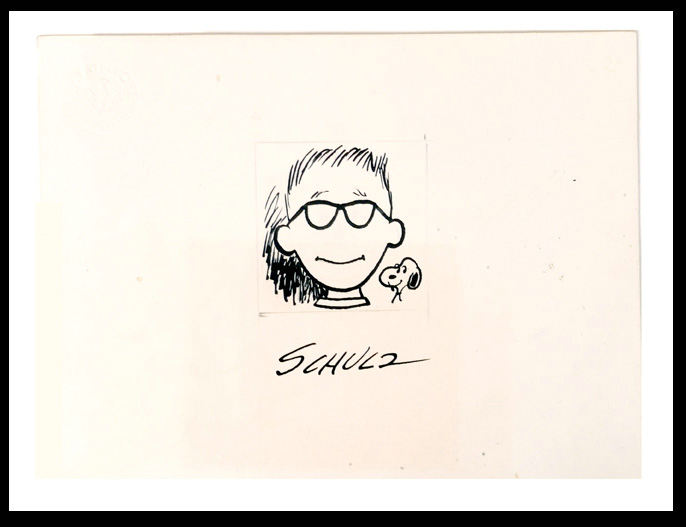
Talking about the film, my brother Maurizio pointed out to me how much this first visual is reminiscent of the famous "Triple self-portrait" by Norman Rockwell.

In the painting, Rockwell presents three versions of himself. Painted on the canvas is the suave, knowing Norman Rockwell. With the pipe securely held between the slightly smiling lips, the portrait suggests confidence. But in the mirror Rockwell looks far less secure. His pipe hangs downwards and a reflection on his spectacles (absent in the portrait with the portrait) blanks out the eyes, suggesting even more cluelessness (something that reminds me of the "featurelessness" of another self portrait of an American artist: Charles M. Schultz)
This multiplicity expressed by Rockwell is absent in its visual equivalent in Bridge of Spies, but implied in its narrative: who is Abel really?
Steven Spielberg is both a fan and a collector of Rockwell's work (and trustee emeritus at the Rockwell Museum, MA), so it is not surprising that Rockwell-inspired images crop up in his work.
For instance, this iconic moment in Schindler's List...

... stems from the very well known "The Problem We All Live With".

Spielberg himself is on the record saying that many images in E.T. were inspired by Rockwell, although I cannot find some direct evidence.
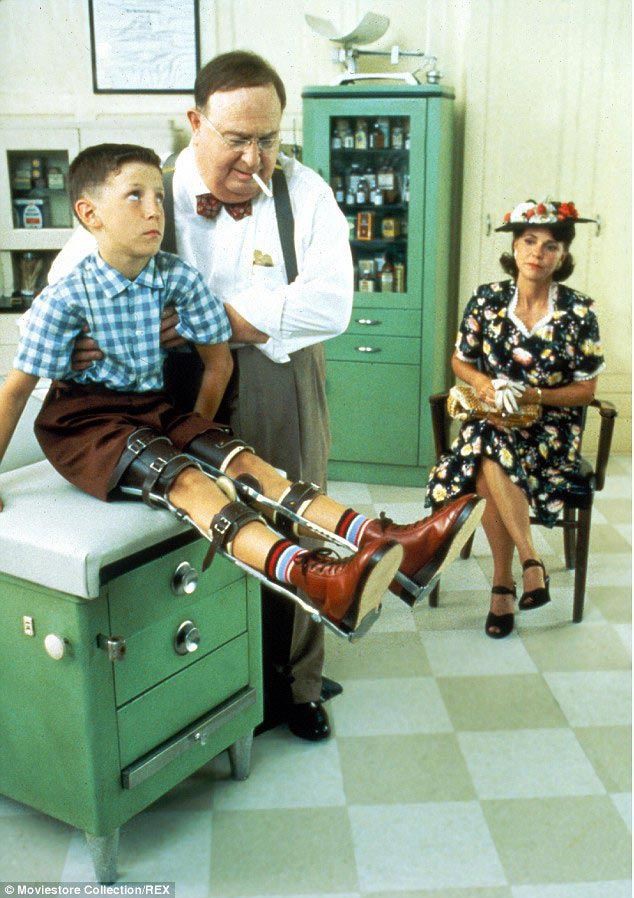
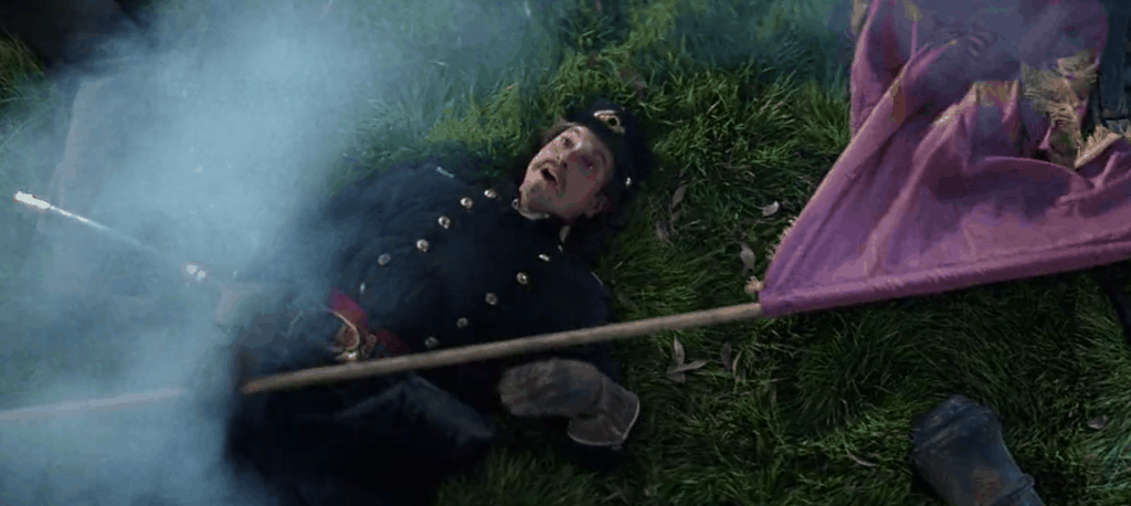
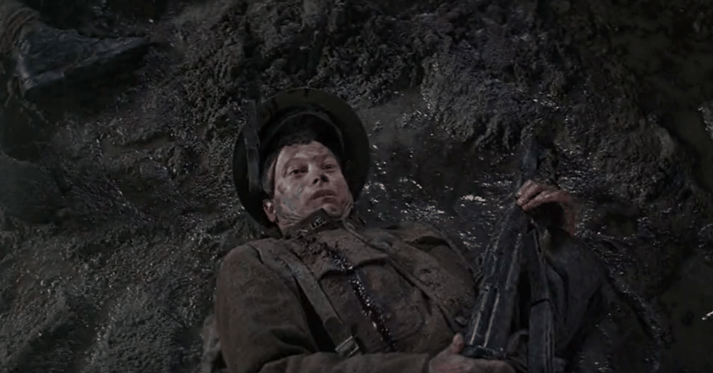
The oldest direct quote I was able to trace comes from The Empire of the Sun (1987), based on the novel by J.G. Ballard.
At first this quote stroke me as incongruent. Why a movie based on the memoirs of a British kid in Shanghai would be a good place to reference an American painting? Apart form the time period I could see no connection.

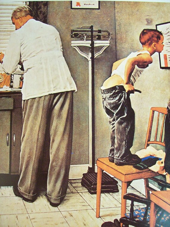
But at closer inspection the 1941 painting, called "Freedom from Fear", which is part of a series of four, reveals its thematic resonance with the movie.
The headline on the paper in the painting contains the word "BOMB", which, unbeknownst to Rockwell, will take new meaning when "THE bomb" will be dropped on Hiroshima in 1945 (that very event also plays an important role in the movie's third act).
That is what i like about Spielberg's adoption of Rockwell's imagery: he's not making literal quotations for the sake of it, but rather borrowing Rockwell's strong visual language to explore similar thematic material, be it identity, intolerance, a safe shelter in wartime.
It is a different approach than Zemeckis', whose quotation were more direct because the intention was to evoke a precise era and its feeling (in this sense, the quotations in Forrest Gump serve the same purpose as the pop-hits featured in the soundtrack).
One last quote is from Spielberg's penultimate movie to-date, The Post.
Spielberg stages a scene with a woman pressured (or advised) by men...


...just like Rockwell did in his "Jury Room" (1959)...

... which was most likely inspired either by the teleplay 12 Angry Men (1954), or by its movie adaptation of 1957.

And in this game of mirrors, quotations and deceit,
Rockwell's "Jury Room" has apparently seeped out of the realm of fiction in to our reality: this picture has been taken during the last G7 summit.

Rockwell's "Jury Room" has apparently seeped out of the realm of fiction in to our reality: this picture has been taken during the last G7 summit.

(again: thanks to my brother to point out this last connection).


