Friday, 8 April 2016

A long essay about INKING

Still swamped by family and work obligation that keep me away from the drawing board, I try to move things along anyway.

I had plenty of story ideas, didn’t need a new one, but a friend of my challenged me by passing me a short poem and challenging me to make a comic out of it.

I took the challenged and scripted the thing in a couple of days.

I did some preliminary sketching and now I’m off to the actual drawing.
Funny thing is that the opening panel (that has now become the opening splash page) is the hardest thing in the whole story.

So I’m taking my time with it, not wanting to mess it up right off the start.

And of course I’m already fearing the moment I’ll have to ink the mofo.

I’m a pretty bad inker. My good friend Taiyo still satirizes me about it. And for a reason.

I tried to look at the masters to see what I can pick from them, but still I felt very much like a guy on a first date as described by Louis CK: “A blind dick in space, thrusting into infinite directions”.

And it’s not that I don’t know what style I want to work with (which is a problem, but a problem I do not want to solve by just picking one style and sticking to it, but rather through sheer perseverance to find MY style).

It’s that I don’t know what I’m doing when I ink. Am I tracing? Am I drawing? Am I improvising?

I often thought it was the pencils. Should they be tight? OR not? It’s the pen or brush I’m using?

So I sat down. And started to think.

And suddenly I think I have it.

It’s about RENDERING.

The comic art I grew up on and I still love, it’s as much a product of the artists as it is a product of the limitation of reproduction techniques (and I’m no longer talking about vision-challenged genitalia).

The solid black line art so typical of comics was dictated by the inadequate printing tools and the poor paper used for comic books and newspapers for many decades.

Because of this, artists had to develop this specific graphical language that could suggest reality.
Out of this necessity a sort of “grammar of the lines” was born, a grammar stillin use today.

This "grammar" was further advanced by the fact that comic books were printed in colors. Cross hatching, dry brushing and other visual devices were no longer used to represent different tones. This solid-black-lines-based style emphasize CONTOURS rather then TONE VALUES and somehow cemented in my mind the idea that LINES were the fundation of the art.
.
Well, WRONG.

 IT IS ALL ABOUT RENDERING.

I've written it large and centered, so I won't forget it.
I should put it on a cue card and place it above my desk.

Of course there are a whole lotta elements that need be there in an illustration or a panel: composition, anatomy, body language, use of negative space and so on.

Cartoonists should better be good at a LOT of things that do not always come together.

But when time comes to finish an illustration, rendering is vital.

Hair, tone, textures, reliefs, clothing. The ink drawing has to suggest the tone, rather than draw the contour.

So I have come up with 4 tips, four exercises for myself first, but hopefully for anyone who may be struggling with inking.

1) Practice ALLA PRIMA ink drawings.
Either copying other artists' stuff, or photographs, or out of your own head, practice drawing with no pencil drawing or sketch underneath (maybe just a few marks to get the proportions right).
This should help developing this skills
a) build up confidence, which usually translates in fresher, more appealing drawings
b) train you to think in terms of final inked art.

2) Copy the artists you like the most and whom you consider the best inkers IN PENCILS
Since my issue in particular with pencils art that does not instruct or even suggest much about the actual final inked rendering, I decided to do some reverse engineering and train myself to think in terms of final art FROM THE PENCILING STAGE.
Make the pencil pass not only about getting the proportions, the pose, the expressions right, but be mindful of what the final art will need.

3) Shamelessy rip-off shorthand ways to do stuff.
My shortcomings as an inker come across more blatantly with some aspects rather than others.
One way around this is locating those problem areas (rendering of hair, thickness of contour lines, placement of shadows) and JUST COPY SOLUTIONS from artists you think solve those problems brilliantly.
This approach in general can be applied to a lot of other aspects, not only the inks, but layouts as well.
I do not see much disgrace in borrowing or even stealing solutions from the masters. There is a downside, though: this way you do not think about how the artist came up with his/her shorthand way of rendering something in the first place. And lack of knowledge or awareness usually translates in poorer art and will limit your range when faced with a new problem you cannot find a solution for in one of your masters' ouvre.

4) Don't do anything.
Which seems pretty much a in contradiction with what I just written, but stay with me for a second will ya?
While my inking has been mocked since those distant school days, my skills as a draftsman received some praise. This is not the place to brag or even defend my work, but I think it's safe to assume I have some skills and that my sketches do have some value.
Since modern technology does no longer require inking in solid black and white, why bother? Why not just use the techniques I'm most comfortable with OR just do with INK what I do with pencils or any other tool, without the urge to learn how to render?
Play to my strengths.

I should give this a try.

I suppose I just need practice and that improvements will come as a result of all of the above.

I'm not certain this long rambling made any sense to anyone other than myself, but I really needed to put it down.

Here below some links.

this tutorial is so far one of the best I've ever found.
Even the greatest masters are often unable to deconstruct and rationalize about their own processes, making art teaching a very rare skill
MAD illustrator Tom Richmond has the ability to break it down in a very accessible and straightforward language and deals with the "pressure" element of inking with actual ink (the irreversibility of the process makes it often a bit scary) using tools like brushes and quills which we do not use much in "real life".

http://www.tomrichmond.com/2006/08/21/inking-tutorial-part-i/
http://www.tomrichmond.com/2006/08/22/inking-tutorial-part-ii/

It is not like taking a class or practicing, but it provides some very good insights.

The following tutorial by Joe Kubert suffers from some of the flaws I was writing about: Kubert is not breaking down HOW he does it, but even only watching a master at work is of some help.

Comic Books Youtube Bonanza

It looks like the only thing left about the internet I still enjoy is browsing through YouTube looking for insightful video or audio documentaries.

here are some about comics:


Tuesday, 8 March 2016

Just links

I'm terribly lazy and I have no time for a proper Blog entry.

Still these is pretty good stuff and I don't want to forget to share it

http://sirspamdalot.livejournal.com/87692.html

Plus

http://www.tested.com/art/movies/470947-colin-cantwells-pre-production-work-star-wars/


Tuesday, 1 March 2016

Links

I wonder if there is some way to use THIS TOOL showcased in this video


to essentially create wire sculptures in a virtual environment

http://andreasdeja.blogspot.fr/2016/02/horse-and-jockey-in-wire.html

the possibilities for a very interesting hybrid of hand-drawn and 3D animation really give me the tingles...

And as a continuation of last post:

check this other interesting Kirby article

and well... just check the whole blog.

Monday, 29 February 2016

Kyrby's 2001

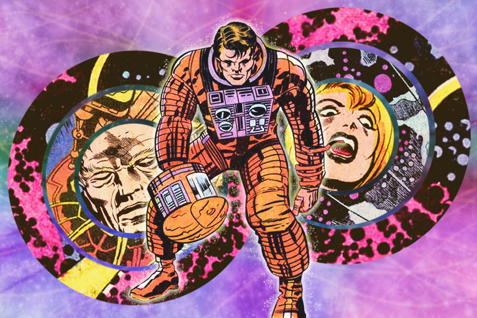
I definitely gotta get me a copy of Kirby's adaptation of 2001: a Space Odyssey.


http://www.twomorrows.com/kirby/articles/312001.html

http://sequart.org/magazine/20651/on-jack-kirbys-2001-a-space-odyssey/


Tuesday, 9 February 2016

Mina wants a picture

Another thingie using my family as a source for inspiration...

I'm planning to translate this one in English asap


My wife objects that I portray our daughter unfairly, but her temper tantrums provide great comedic material.

I love her of course and I wouldn't change her a bit.

And we can also work great together as you can see from these lovely double self-portraits we drew together (literally, we were both holding the pen at once).


Monday, 8 February 2016

Season Greetings

Another card, this time for new Christmas and New Year.
since my daughter Mina is a massive Frozen enthusiast, we decided to use it as a theme for this card we sent to family and friends.

Personally I barely stand this movie, abut I kind of get why it seems to be popular among kids and adults alike.

I had some fun with the style for this one. I'm not over Sarah Ogilvie yet, and I did not want to go full Disney.
I'm kind of pleased with the result.

I had some hard time with the coloring of the line art (which has been done separately from the rest).

I finally opted to use a cheap Photoshop filter (posterize, I believe) for the printed version, to boost the contours, fearing otherwise that they would get muddled up with the colors.

Here's the two versions...

For Sara Ogilvie, look also here and here.


Thursday, 28 January 2016

When you walk through the garden...

Finally finished.

meh...

at least is out of the system now...


Tuesday, 15 December 2015

Neil Gaiman's 2002 deposition

Following the Gaiman's trend of the last posts, here's an interesting find:

http://ohdannyboy.blogspot.fr/2014/05/humility-its-not-word-that-todd-would.html

A very long but illuminating read.

And what about Neil Gaiman's being a Scientologist?


Monday, 14 December 2015

Gaiman and Spiegelman in conversation

I'm only 7 minutes in this and it's already an absolutely great listen.


Enjoy

Friday, 4 December 2015

Ask The Author: Alan Moore

It looks like Alan moore has a page on the GoodReads website. Which is odd (he also has a Facebook page and Twitter, so maybe it isn't).
I doubt the site would not double check the veracity of the account.
Plus the answers read very much like Alan Moore.

As usual. Everything the man says is worth reading or listening.


Thursday, 3 December 2015

Two of my favorite...

Two of my favorite people (among those I don't know personally) in two excerpts from an evening held at the Connecticut Forum in 2012.

Nothing to do with comics, but I really enjoy listening to the two Neils talking. They have the rare gift of being articulate, precise but not overly verbose.


Monday, 2 November 2015

And I'm finally back... again!

Sorry folks (folks?! ahahaha!!)
Sorry casual reader for letting you down... hey, maybe tha'ts why it's called Down the Guts. HA!

Anyway, my original intention to dedicate my blog to comics or at most animation really limit the range of stuff I can share, so I'm going to include random finds here as well.

I'll try to keep it about various forms of storytelling anyway (meaning I'll be talking about movies), in spite of my actual disgust with this current shapeless amalgama that goes under the name of "geek culture" or even worse "pop culture".

It's not that I cosider TV or movies as opposed to comics, but I kind of miss the times when liking comics was something a lot o f people kept closeted.

No, it's not that either.

It's just that I hate seeing a lot of people juming on the band wagon.

Going to Lucca Comics has become something of an obligation for anyone who got something to sell, regardless of its pertainance with comics. I mean, I ADORE Bizzarrobazar.com for instance, I really think it's one of the best places on the web, but how does that blog has anything to do with Lucca Comics?

My brother put that brilliantly some time ago: "When I was young, there wasn't all this p***y around Star Wars".

I'm really having a hard time adapting to this trend (don't get me started about San Diego)

I guess it has something to do with what the GRAT ALAN MOORE says here:

https://www.youtube.com/watch?v=93sV5XGLmgQ&feature=youtu.be&t=14m


That said. enjoy this videos about Steven Speilberg's DUEL.


Thursday, 24 September 2015

Fun with invitation cards...

Almost at the last useful minute I was able to make an invitation card for the birthday party of my soon-to-be-6-years-old son.

It was hard to settle what the "theme" of the party was going to be.
As a kid in a candy store, he wanted to have it all.
At first he choose "magic tricks", but then he preferred "arts and crafts", then Star Wars...

I soon learned you should not involve a not-6-yet kid in any open-choice decision making process.

Ultimately I decided to poke a little fun at him, and the card involves exactly his indecision about it.

(he took it well, I must say. For a kid he can be self-deprecating at times. I'll give him that)

I screwed it up anyway. The lay out is a bit off, and I should have placed the balloons better to guide the eye. Its not quite clear which panels/balloons you should read first.

But it was fun to do and I'm enjoying this loose cartoony style recently. It's not as solid as I want it to be, I guess I need more practice...


Tuesday, 22 September 2015

Blip

A very long time since my last post.
Very little to post, actually...

Here's some stuff I've been doing lately.

The upside down Spiday is just something I wanted to do for fun, and it's sahmelessly ripped off a wonderful Michael Lark variant cover (which I cannot link right now... to bad)

The second is instead an attempt to draw Spider-Man in a "spider-man-esque" pose without ripping it off.


These come from a work in the making... sort of.
I'm keeping this under wraps for the time being...
colors by Shanna Paulissen


Monday, 20 July 2015

Another Chuck Jones


Tuesday, 3 March 2015

Totally subscribing

Coming in late to this one.
Never been particularly fond of Pat Broderick, but I subscribe his words down to every comma

http://www.telegraph.co.uk/culture/books/booknews/11275179/pat-broderick-facebook-cosplay-rant.html

 ----

Also found a very funny quote on the conceptart.org website, attributed to user Flipnastywebby:

"...somebody once told me, only draw anime if you can cure cancer with it."

Word. 

Friday, 27 February 2015

R.I.P. Walt Peregoy


The sad news can be found here:

http://www.cartoonbrew.com/rip/walt-peregoy-101-dalmatians-color-stylist-rip-108028.html

I wanted to make a brief post about it, but it turned in something more articulate. Hope you don't mind.

I've been unknowingly familiar (as many kids) with the work of this genius since early childhood, since his styling has essentially defined the look of many HANNA-BARBERA cartoons I used to watch.


However, I only sought out his work last year, when trying to find an interesting (and hopefully efficient and time-saving) way to color my "Werewolf" story (more on that later).

This comic was originally meant to be in black and white, but the editor of the digital magazine where the story was going to be published (in five installments) wanted it to be in color, to balance other black and white content.

Apart from the style of choice (which wouldn't suit color well) a problem was posed by the deadlines I had to meet. I had no experience in digital coloring, so I had to learn by doing it. What I needed was least a coloring approach which could speed up the process.

I don't know why but I suddenly thought of Walt Disney’s One Hundred and One Dalmatians.
It was the first cartoon to apply the "sketchy" Disney style I previously (and wrongly) attributed to Wolfgang Reitherman. But that style was actually the result of solving a budget problem.
Veteran animator and Mickey Mouse co-creator Ub Ikwers had come up with a way to cut the expensive INKING process, by using the then new XEROX technology to transfer the animation pencils directly to acetated cells in solid black color
.
For the first time what would be photographed was not the "cleanup", but the actual pencil animation, which gave the characters that peculiar rough-edged feel.

But more unique to Dalmatians was the way backgrounds blended stylistically with the animation.

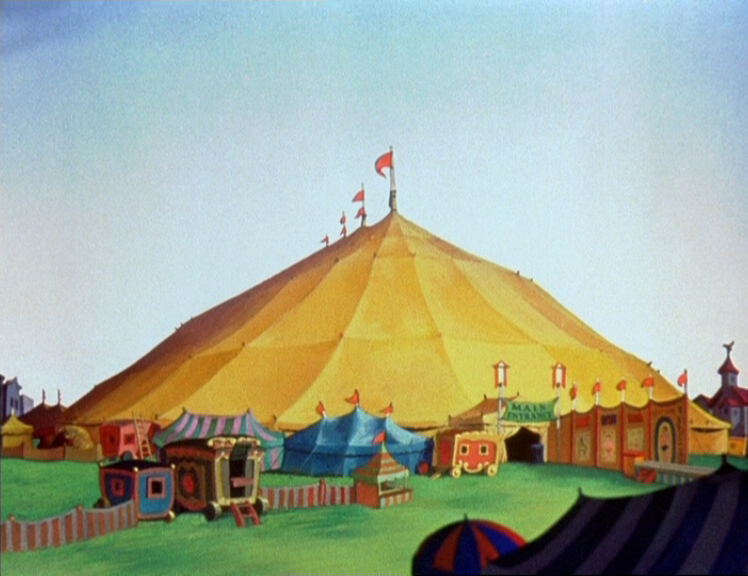
Up until then, if one excludes the first 5 or 8 years of shorts, Disney backgrounds used a lavish pictorial style. Sometimes, soft and simplified (Dumbo),


sometimes almost impressionistic (Bambi)


sometimes rich and detailed (Sleeping Beauty).


I always found a bit strange that while the characters are stylized, (often rendered only through contours and lines, shading mostly absent) the backgrounds, albeit not REALISTIC, are rendered in a completely different technique.

In his essay Understanding Comics, Scott McCloud makes the point that this very choice is what makes Disney movies so accessible and yet so immersive. We can project ourselves far more easily in to simplified, stylized characters, but at the same times we "buy" their world because of the detail with which it is depicted.

For Scott McCloud, this technique is analog to what Japanese manga do (for instance, think of the contrast in Masamune Shirow's Appleseed, between the increasingly cartoony face of Deunan and the extremely detailed technology in the background)

But apparently this problem of "blending" characters and background together was something that bothered Walt Disney’s renaissance man Ken Anderson, who saw in the new xerox technique and in the contemporary setting of the movie an opportunity to experiment with a new style of backgrounds.

And here comes in Walt Peregoy.
A longtime collaborator of the studio, Peregoy was the color stylist for many Disney productions, and his contribution to Dalmatians cannot be understated.

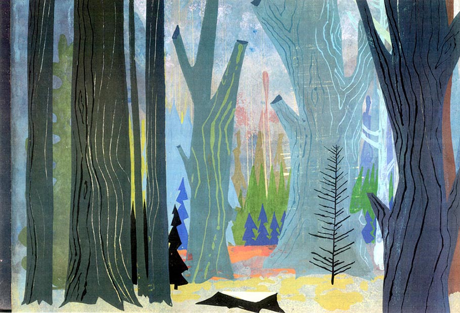
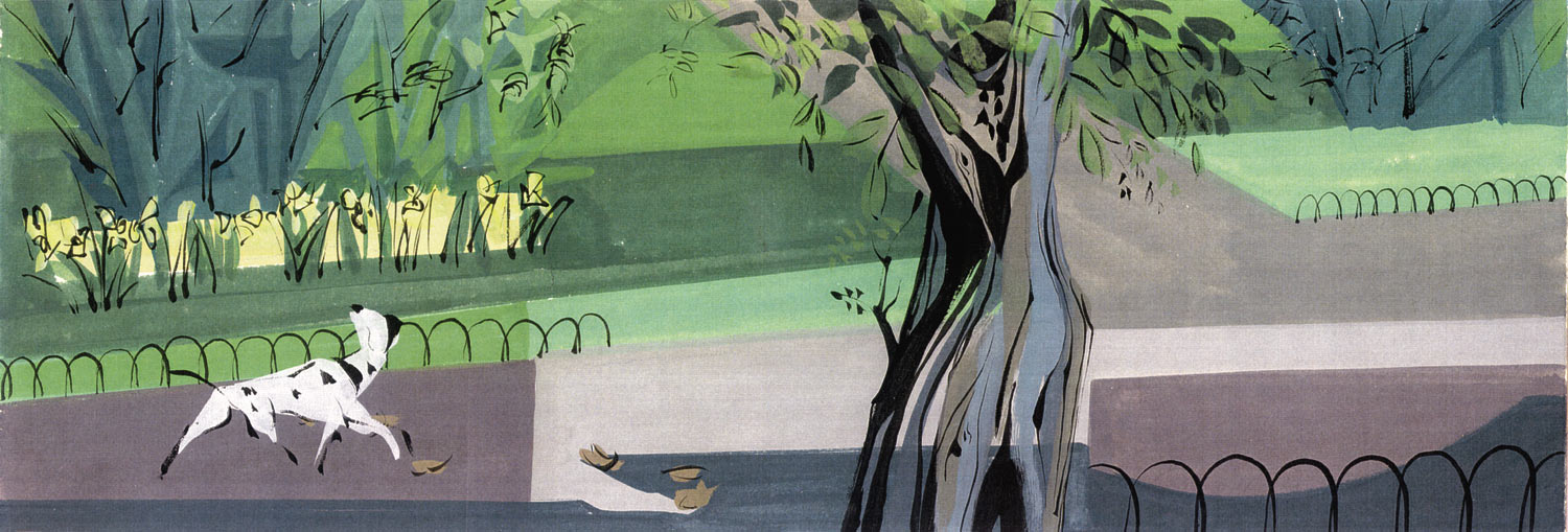
In the movie, the modernlystylized backgrounds by Ken Anderson and Ernie Nordli (slightly asymmetrical and tending to caricature) were superimposed over flat, almost abstract patches of color, with stunning results.


Background artists Al Dempster, Ralph Hulett, Anthony Rizzo & Bill Layne followed very closely the styling as dictated by Peregoy.


As Brad Bird points out in this video, this style is only deceptively simple.
It requires a great degree of draftsmanship, extreme color sensibility: the illustrator has to become a designer.


I've attempted (with little success) to apply some of these principles (textures, bleeding) to my own work.
I'll let you judge the results, but they are far from satisfactory.


The only pride I have in this work is that I was able to deliver on schedule! (by basically giving up sleeping - which led to acute forgetfulness - which led to discovering I'm probably ADD anyway - which led to... oh, screw it. That's going to be my next post).

you can listen to a two-parter interview with Peregoy here 
and here. (thanks to The Animation Guild blog)


***


In many ways the work of Peregoy (Anderson and Nordli) reminds me a lot of Mirosalv Sasek

And in more recent years i find the same qualities in Lou Romano's designs.

Somehow I guess my fondness for this style of design traces back to some books I used to have around the house when I was a kid.

In giro per il mondo con Disney  (Around the world with Disney):


The book series Il Club delle Giovani Marmotte (Junior Woodchucks Club):


And the guidebooks called Il manuale delle giovani marmotte (Junior Woodchucks Guidebook), volumes 1 to 3:


These books were all illustrated by Italian Disney Maestro Giovan Battista Carpi.

As a kid I didn't particularly like his style, preferring the more modern Giorgio Cavazzano, Massimo De Vita or Stefano Intini, but when re-thinking years later about it, I must admit Carpi really had an incredible sense of design.


Monday, 23 February 2015

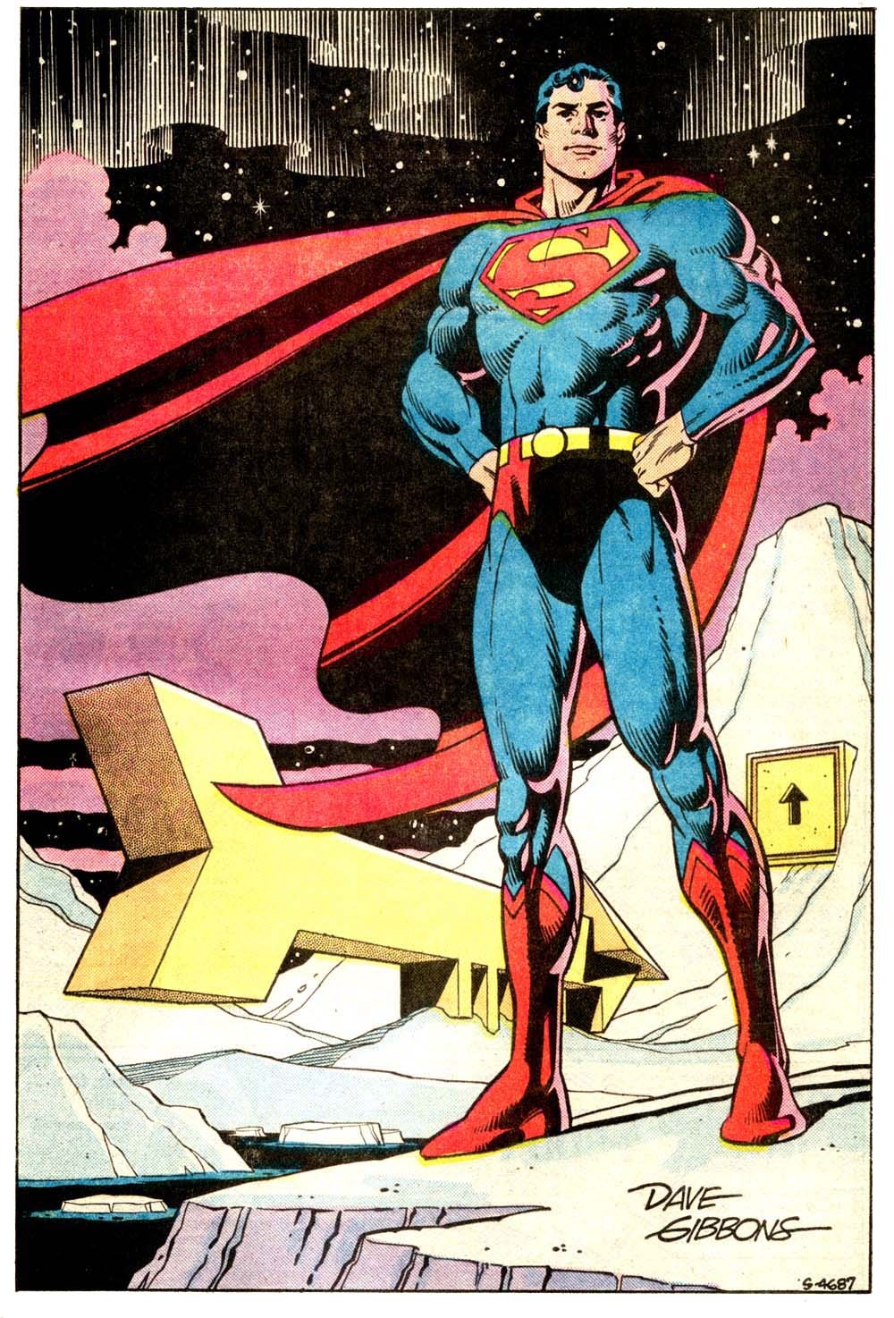
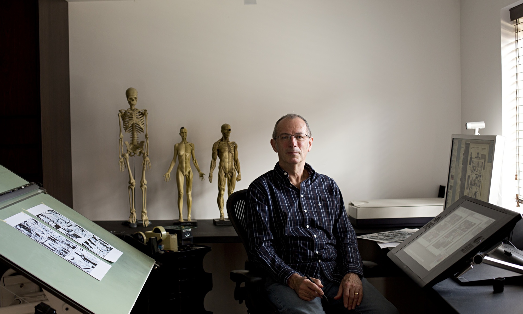
Dave Gibbons


Dave Gibbons needs no introductions: co-author of the seminal WATCHMEN and frequent collaborator of Northampton's scribe Alan Moore, Dave Gibbons is on of the most complete artists working in mainstream comics: penciller, inker, writer letterer, you name it.
His graphic style is a perfect blend of the american and european traditions.

I do not love his style viscerally as I do with other artists, but on some stories it just works perfectly.

There is undoubtly a staggering level of craft and we can all learn from his details and uncompromising technique.

He's also one of the most articulated people working in the field, no it is no surprise that this conversation with Bleeding Cool's Chris Thompson is very enjoyable to listen.

Of course, the reason for him to be interviewed at this particular time is the release of a movie based on a graphic novel he worked on (Kingsman - The Secret Service), so there you have it again: comics getting second-rated by movies.

But still...


Monday, 16 February 2015

The WIRE fan art

Just received the pre-press proof of my next book. and it looks like the link to this blog will be put in print.

Not that I expect an increase in traffic to this page, but keeping it up-to-date maybe isn't such a bad idea...

Unfortunately not much to post in terms of comics/animation-related content, so I've decided to share this work in progress.

If you have read some of my provious posts you know I really loved The Wire.

I feel kind of dual in regards to fan art. On one hand I find it a form of masturbation. A way to rub one's self into comforting and familiar feelings.

On the other hand I can't deny that some works greatly inspire our imagination and provide an entrance in to the realm of creativity.

As much as I have outgrown my passion for Star Wars or the superhero genre, I totally understand that some imaginary worlds and its inhabitants are simply too good and full of potential to be left alone.

And anyway, having a shot at portraying our favorite fictional characters is a way to exercise and train our skills, and that's always good.

So, here's a little rough for an upcoming pin-up of LT. DANIELS from David Simon and Ed Burns's The Wire.
I hope to finish this one soon...

Plus, soem sketches done using other characters as references (they don't look like much, gotta say)...


to conclude: online you can find a lot of Wire Fan art just by googling. Only a few honorable mentions for the following

Prezbo, Frank, Rhonda and Kima and by Greg Smallwood:


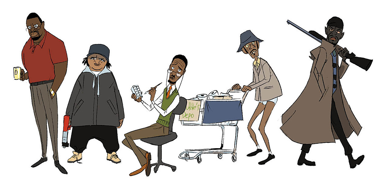
And two  nice caartoonish rendition of some characters by Paul Sizer and an unknown artis (respectively)