

I should just post stuff on this blog.
Found on Eddie Campbell's blog (sadly not updated in a long
time, maybe he's on tumblr now) here's a sample of Alan Moore's writing for
From Hell.
If you want to further explore the creative rocess behind
one of the best graphic novels in history, be sure to purchase The From HellCompanion from Top Shelf (available also on Amazon)
---
As much as I love Alan Moore, among the finest writers (if
not THE finest) to grace the medium, this is not the way to write a script.

In itself Mr. Moore's scripts are a dlightful read, like
letters to the artist, where Mr. Moore shares his thoughts and feelings, making
therefore the artist participate more.
But all that information is put together with actual
panel/action descriptions in a stream-of-conciousness fashion. they are also written from the perspective of the omniscent writer, who is sharing a lot of information not about what is shown or said, but rhather what is not yet reevealed and about where the story is going.
To Alan Moore's credit, formatting rules are somewhat less
strict in comics than, for instance, film or television.
A page of screen- or teleplay should translate into one
minute of footage. Formatting is of the essence in order to achieve that.
Besides, a proper formatting helps the many people and
departments the script must go thorugh, staying on the same page (pun
intended).
In comics the length of the description does not affect the
number of pages/panels an action is going to take. (the length of the dialogue
is a lot more important, and in that regard Alan Moore is very careful never to
use too many words per panel).
Scripts are also meant to be read only by a handful of people
participating in the process;: penciler, inker, letterer, colorist and editor.
If one considers that FROM HELL has Eddie Campbell as the
ONLY artist/inker/letterer and that the book was not colored (nor edited, I
believe), then how the script is formatted is up to the creative duo.
Still, I would rather separate the considerations about the
story from the actual "technical" script, for no other reason that
when used for lay-outing the pages or finishing the art, it can be tough having
to go through a phone-book-thick script full of (however amusing) anecdotes. I
would rather produce a polished and tidy script preceded by a separate
commentary text.
The way Mr. Moore write his scripts is probably the result
of him going directly from notes to final draft (and again, to his credit, that
is pretty awe-inspiring).
As a consequence, his thinking is right there on the page.
Separating the straight instructions from all the rest would
probably take longer, and maybe Alan Moore does not want to waste his time.
But even once removed what is commentary, the panel
descriptions tend to be very, very precise.
Campbell feels comfortable enough ignoring some of the
directions when he thinks he has a better idea (and once more, to Moore's
credit, he always encourages artists to come up with better ideas).
There are different philosophies about how precise the directions
ought to be, especially with reference to the blocking and the framing of the
action.
I suppose editors will probably suggest to keep it short, to
facilitate reading.
Some writers will respond that if left to their own devices,
Some artists will lose sight on storytelling and will make continuity errors.
While artist may complain that direction too-details are
"limiting" "constrictive".
Some inexperienced writer may also make the mistake of
stuffing the panel with details, character and dialogue to an impossible
degree.
To me, what's important is the final result.
If a particular framing or character disposition is
essential to the story, then the writer is 100% entitled to give directions.
There is a very good chance that an experienced visual storyteller will
construct a very effective scene.
The writer can of course avoid providing full directions, as
long as what he asks to depict is a MOMENT that can translate in to a still
picture (and not something like: Andy open's the can of beer and drink it).
I suppose that a writer who know what he or she is doing can
leave a lot to the artist, because the description will anyway suggest the
appropriate angle (that is, if he or she is working with a competent artist).
Moore's record is such that I will always try to follow his
indications.
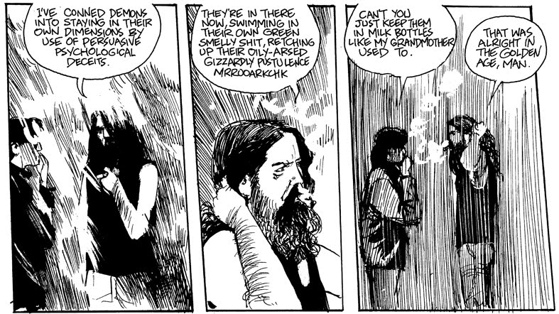
What I don't forgive here is the massive use of "we
see" and "us" in the directions.
That is something I learned from Mystery Man.
No "we see" in a script. Period.
In a visual medium, it's pretty obvious we are seeing
something, ain't it?
One last bit of business is the ALL CAPS descriptions as opposed
to the small caps dialogue.
Personally I would prefer to have it done the other way
around or better yet, all in small caps.
I ignore why Alan Moore goes ALL CAPS for the directions, I
know that the small caps in dialogue is used to make it easy to spot on a quick
look.
I solve that by using a longer indent for dialogue and using
bold or ALL CAPS to highlight speech balloons.
(The indent also helps me keeping the text getting too long for a single balloon.)
Concluding: the "Alan Moore Script" may be a
literary genre in itself., absolutely fun to read, but I would discourage anyone
from scriptiong in the same fashion.
I'd suggest to keep directions dry (not dull, though) and
make every noun, verb, adverb and adjective
count.
If the artist's comfort is important to you, I would suggest
to try to fix one page of comic in one page of script, purely for practical
reason, but clarity come first, so if one page isn't enough, then go long.
Two way to compromise on this are
- Make one page of comic fit in one SHEET of paper, going double-sided if needed, and keeping the back side blank when the direction for the given page fit on the front only) side
- Adapt the font size to the page length: samller fonts when a page require longer directions.
----
“THE NEMESIS OF NEGLECT” (40 PAGES)
PAGE 1.
PANEL 1.
HELLO, EDDIE. WELL, HERE WE ARE: MORE THAN A HUNDRED PAGES
INTO THE STORY AND WE FINALLY REACH THE FIRST MURDER. IT STRIKES ME THAT HAVING
DONE SUCH A GOOD JOB OF MAKING THE MUNDANE MEANINGFUL AND DRAMATIC FOR THE PAST
FIVE INSTALMENTS. WE MAY HAVE SOMETHING OF A PROBLEM WHEN IT COMES TO THIS
FIRST MURDER; THE FIRST CONVENTIONALLY DRAMATIC MOMENT THAT WE’VE BEEN CALLED
UPON TO DESCRIBE. I THINK WE NEED TO MAKE IT AS FLAT AND UNEVENTFUL AS WE DID
THE SEX SECENE BETWEEN ANNIE AND EDDY BACK IN CHAPTER ONE, ALTHOUGH AT THE SAME
TIME WE DO NEED TO CONVEY SOME OF THE HIDEOUS FORCE AND MOMENT THAT HAS GONE
INTO THE EVENT. ALSO, WHILE WE MAINTAIN THE AIR OF NORMALITY THAT WE’VE
CAREFULLY BUILT UP, WE ALSO HAVE TO MAINTAIN THE ATMOSPHERE OF STRANGENESS THAT
WE’VE IMPLIED BEHIND THE EVERYDAY VICTORIAN FAÇADE. A TRICKY ONE, BUT I’M SURE
WE’LL HANDLE IT OKAY WHEN WE ACTUALLY GET TO THE SCENE IN QUESTION.
THIS FIRST PAGE IS ONE OF THREE THAT MAKE UP OUR OPENING
SEQUENCE, A PUZZLING AND ANOMALOUS LITTLE VIGNETTE THAT TAKES PLACE IN AUSTRIA.
THE FIRST PAGE HAS THREE TIERS. ON THE UPPERMOST TIER WE HAVE THE BORDERLESS
WHITE SPACE TO THE LEFT WHERE WE TRADITIONALLY SET OUT EPISODE TITLE, AND THEN
A DOUBLE WIDTH PANEL TAKING UP THE REST OF THE TIER. THE LOWER TWO TIERS EACH
HAVE THREE PANELS, MAKING THIS AN EIGHT-PANEL PAGE, INCLUDING THE TITLE PANEL.
TITLES: CHAPTER V: THE NEMESIS OF NEGLECT
PANEL 2.
IN THIS FIRST PANEL WE HAVE AN AERIAL SHOT OF A SMALL TWO
STORY BUILDING THAT STANDS ON THE OUTSKIRTS OF THE UPPER-AUSTRIAN TOWNSHIP OF
BRAUNAU. WE ARE LOOKING DOWN AT THE HOUSE, WHICH STANDS IN A FAIRLY ISOLATED
POSITION RELATIVE TO THE REST OF THE TOWN, THROUGH A FINE VEIL OF POWDERY,
FALLING SNOW. WE ARE HIGH ABOVE IT HERE AS WE LOOK DOWN, AND THE ISOLATED HOUSE
IS THE MAIN FOCUS OF OUR VISUAL ATTENTION, WITH THE REST OF THE TOWN MERELY A
SUGGESTION; A DARK HUDDLE OF BUILDINGS SOMEHWERE TOWARDS THE UPPER REACHES OF
THE PANEL THAT DOES NOT DISTRACT FROM OUR FOCUS UPON THE HOUSE. IT IS THE EARLY
AUGUST OF 1888, AND IT IS NIGHT TIME, ALTHOUGH THE CLARITY WITH WHICH WE CAN
SEE THE HOUSE FAR BELOW US, EVEN THROUGH THE FALLING SNOW, SUGGESTS THAT THE
SCENE MUST BE ILLUMINATED BY THE LIGHT OF SOME OFF-PANEL FULL MOON. THE SNOW
BLOWS IN WILD GUSTS ACROSS OUR IMAGE, BUT PERHAPS WE CAN SEE A TINY PIN PRICK
OF LIGHT IN THE UPPER STOREY OF THE BUILDING: A LIT WINDOW. IF WE ARE TOO HIGH
FOR THIS TO BE PRACTICABLE, THEN JUST LEAVE IT OUT AND WE’LL ESTABLISH THE LIT
WINDOW IN OUR NEXT PANEL.
CAPTION: Braunau, Upper Austria. August, 1888.
PANEL 3.
NOW THE FIRST OF THE THREE SMALLER PANELS THAT MAKE UP THIS
CENTRAL TIER. SLOWLY, WE ARE CLOSING IN FROM OUR OPENING IMAGE, ZOOMING SLOWLY
DOWN TOWARDS THE HOUSE BENEATH US. (YOU SEE WHAT A SEMANTIC MUDDLE YOU GET INTO
WHEN YOU START USING CINEMATIC TERMINOLOGY? “ZOOMING SLOWLY”.) ALTHOUGH THE
SNOWFLAKES STILL BOWL IN A LUMINOUS FREE-FALL ACROSS THE FOREGROUND OF THE
PANEL, WE CAN NOW SEE THE HOUSE IN MUCH GREATER DETAIL, SINCE WE ARE HOVERING
JUST ABOVE THE ROOF AND LOOKING DOWN. WE CAN CLEARLY SEE THE LIGHT IN THE UPPER
STORY WINDOW, ALTHOUGH THE REST OF THE WINDOWS ARE DARK. ALTHOUGH IT IS MADE
NOWHERE EVIDENT IN
THE TEXT THAT FOLLOWS, THE HOUSE IS THAT BELONGING TO THE
CUSTOMS OFFICIAL ALOIS HITLER AND HIS WIFE KLARA. I’M AFRAID THAT THE BIOGRAPHY
OF HITLER THAT I’VE CONSULTED FOR MY REFERENCE HAS NO PICTURE SECTION, SO
YOU’RE ON YOUR OWN AS FAR AS FINDING REFERENCE FOR THIS ONE GOES. IF YOU CAN’T
LOCATE A SPECIFIC IMAGE OF HITLER’S PARENTS' HOUSE THEN JUST DO A PIECE OF
TYPICAL AUSTRIAN ARCHITECTURE FROM THAT PERIOD. AS WE LOOK DOWN ON THE HOUSE
HERE, THE ILLUMINATED WINDOW ON THE UPPER STORY IS BECOMIING OUR VISUAL FOCUS
OF ATTENTION.
No Dialogue
PANEL 4.
WE CONTINUE TO CLOSE IN UPON THE ILLUMINATED WINDOW THAT
SHINES BENEATH THE OVERHANGING QAINTNESS OF THE PERIOD AUSTRIAN GABLES, ITS WAN
YELLOW LIGHT PICKING OUT THE SNOWFLAKES AS THEY TUMBLE DOWN PAST IT. WE ARE
LOOKING DOWN AT THE WINDOW FROM SUCH AN ANGLE THAT WE CAN SEE A LITTLE OF THE
ROOM BEYOND IT, ALTHOUGH THIS NEEDN’T BE VERY VISIBLE OR DETAILED AS YET. JUST
SO LONG AS WE ESTABLISH THAT WE WILL BE ABLE TO SEE A LITTLE OF THE ROOM IF WE
CONTINUE TO CLOSE IN ALONG OUR PRESENT COURSE. A SINGLE, TAILLESS SPEECH
BALLOON HANGS IN THE SNOW-SPECKED DARKNESS OUTSIDE THE WINDOW.
TAILLESS BALLOON: ungh
PANEL 5.
NOW WE CLOSE IN SO THAT THE WINDOW FRAME ALSO FILLS THE
ENTIRE PANEL, STILL WITH SOME FLAKES OF SNOW TUMBLING PAST IN THE FOREGROUND.
AS WE LOOK DOWN AND THROUGH THE WINDOW WE CAN SEE INTO THE BEDROOM BEYOND, AND
WE CAN SEE THE TOP HALF OF THE DOUBLE BED THAT IS PRESUMABLY POSITIONED NEAR TO
THE WINDOW. THE SCENE INSIDE THE ROOM IS LIT BY AN OIL LAMP, SOMEWHERE OFF
PANEL. SPRAWLED UPON THE BED, ONLY PARTLY VISIBLE TO US HERE, ARE A MAN AND A
WOMAN. THEY ARE HAVING SEX IN THE MISSIONARY POSITION, THE WOMAN’S LONG
NIGHTGOWN PULLED UP IN A CRUMPLED RUCK TO JUST ABOVE THE BREASTS AS SHE LIES
FACE UP BENEATH HER HUSBAND. THIS IS KLARA HITLER, FORMERLY KLARA POLZL, AND AS
WE SEE HER HERE SHE IS TWENTY-EIGHT YEARS OLD. THE MAN ON TOP OF HER IS ALOIS
HITLER OR HIEDLER, AND HE IS FIFTY-ONE YEARS OLD. AS WITH THE HOUSE IN WHICH
THIS IS HAPPENING, I HAVE NO VISUAL REFERENCE FOR EITHER OF HITLER’S PARENTS.
IF YOU CAN’T FIND ANY EITHER, THEN JUST GO AHEAD AND MAKE THEM UP. I SEE BOTH
OF THEM AS BEING QUITY FLESHY PEOPLE, NOT ESPECIALLY ATTRACTIVE IN ANY OBVIOUS
PHYSICAL SENSE. AS ALOIS GRUNTS AND THRUSTS ON TOP OF HIS WIFE, HIS OWN
NIGHTSHIRT HAVING RIDDEN UP TO HIS WAIST TO REVEAL A DIMPLED AND CORPULENT
BEHIND, BOTH OF THEIR EYES ARE CLOSED. ALOIS CLOSES HIS EYES WITH A SQUINT OF
MIGRAINE-INDUCING EFFORT, WHILE KLARA CLOSES HERS TO ESCAPE TO SOMEWHERE WITH A
MORE PLEASING VIEW. FROM OUR VANTAGE POINT AS WE LOOK DOWN INTO THE ROOM WE CAN
SEE MOST OF THE BED, AND WE CAN PROBABLY SEE THE TWO BODIES MORE OR LESS FULL
FIGURE HERE AS THEY LIE THERE ON TOP OF EACH OTHER. LIT BY THE CREPUSCULAR
YELLOW GLOW OF THE OFF PANEL OIL LAMP, THE LEANING SHADOWS MAKING SOMETHING
STRANGE AND FANTASTIC OF THE SCENE. IT IS THE LIGHTING OF A CRIMEA SURGICAL
TENT, OR THE MURDER ROOM IN A VICTORIAN MELODRAMA. THE BALLOON, BELONGING TO
ALOIS HITLER, IS NEVERTHELESS TAILLESS AND FREE FLOATING, HANGING THERE IN THE
FOREGROUND AMONGST THE TUMBLING SNOW.
TAILLESS BALLOON: ungh
PANEL 6.
WE CONTINUE TO CLOSE IN. WE ARE NOW WITHIN THE ROOM, LOOKING
DOWN UPON THE BED UPON WHICH THE COUPLE ARE… UH… COUPLING. BECAUSE WE ARE
CLOSER TO THEM HERE, WE CANNOT SEE SO MUCH OF THEM. HERE, WE SEE THEM ROUGHLY
THREE QUARTER FIGURE AS THEY LIE THERE BELOW US. THE FOCUS OF OUR ATTENTION,
VISUALLY, IS THE FACE OF KLARA HITLER AS SHE LIES THERE PACING UP TOWARDS US
FROM BENEATH HER THRUSTING HUSBAND, HER FACE VISIBLE OVER HIS SHOULDER. THE
ROOM IS SLOPPY AND LIVED IN, MAYBE WITH THE SIGNS OF HAVING HOSTED TWO PREVIOUS
HITLER CHILDREN, GUSTAV AND IDA, WHO BOTH DIED IN INFANCY. THE SPEECH BALLOONS
ARE STILL TAILLESS AS THEY REMAIN THROUGH THIS SEQUENCE, ALTHOUGH IF THEY COULD
BE PLACED ON ALOIS’ SIDE OF THE PICTURE TO CONVEY THE IMPRESSION THAT THEY
ORIGINATE WITH HIM, IF ONLY SUBTLY.
TAILLESS BALLOON: ungh
PANEL 7.
WE CONTINUE TO CLOSE IN. SO THAT NOW WE ARE LOOKING DOWN AT
THE HITLERS FROM JUST ABOVE THEM, AND THUS SEE THEM ROUGHLY HALF FIGURE. THE
FOCUS OF OUR ATTENTION IS STILL KLARA’S FACE AS SHE TWISTS AND WRITHES BENEATH
THE WEIGH OF HER HUSBAND. HER FACE, VISIBLE OVER HIS SHOULDER, HAS A BROW THAT
IS STUDDED WITH BEADS OF SWEAT AND THE EXPRESSION OF ONE WHO TOSSES AND TURNS
IN A FEVERISH AND ANXIOUS SLEEP. OBLIVIOUS TO THIS, ALOIS CONTINUES TO GRUNT
AND THRUST ABOVE HER, ONLY THE BACK OF HIS HEAD VISIBLE TO US HERE.
TAILLESS BALLOON: ungh
PANEL 8.
IN THIS FINAL PANEL WE CLOSE RIGHT IN FOR A HEAD AND
SHOULDERS SHOT OF KLARA AS SHE FACES UP TOWARDS US FROM UNDER HER HUSBAND, HER
EYES TIGHT SHUT AS HER HEAD PITCHES TO AND FRO WITH THE RHYTHM OF THE
COUPLING. THE SWEAT STANDS OUT ON HER BROW, HER FACE RED AND
FILLED WITH BLOOD SO THAT THE SKIN BECOMES TIGHT AND SHINY. IF WE CAN SEE
ANYTHING OF THE BACK OF ALOIS’ HEAD IT SHOULD ONLY BE ONE EAR OR A BIT OF ONE
SHOULDER, VISIBLE OVER TO THE EXTREME RIGHT EDGE OF THE PANEL, WITH THE FOCUS
OF OUR ATTENTION BEING FIXED SQUARELY UPON KLARA’S FACE. TO BE MORE EXACT, THE
FOCUS OF THE PANEL IS KLARA’S EYE, SINCE THIS IS THE POINT THAT WE WILL BE
ZOOMING IN UPON NEXT PANEL. (I KNOW THAT YOU HATE MEANINGLESS TIGHT CLOSE UPS
OF EYES, BUT THERE IS A VALID STORYTELLING PURPOSE BEHIND THIS ONE, SO TRUST
ME.) THE EXPRESSION OF KLARA’S FACE IS THAT OF SOMEONE WHO IS TWISTING AND
TURNING IN A RESTLESS NIGHTMARE RATHER THAN IN THE THROES OF PASSION. THE
TAILLESS BALLOON HANGS IN SPACE, SOMEWHERE OVER TOWARDS ALOIS’ SIDE OF THE
PANEL.
TAILLESS BALLOON : ungh
and here's the final art


