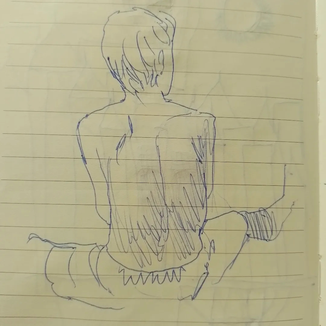
Tempo fa ho pubblicato su questo blog alcuni schizzi raffiguranti vecchietti decrepiti dall'aria sinistra.
Erano una specie di riscaldamento per una breve storia che prima o poi conto di disegnare: un racconto nello stile dei vecchi fumetti della EC.
Una storia del genere richiede che si utilizzi il buon vecchio 'Zio Tibia'.
Ho ricercato informazioni su questo personaggio, nel tentativo di capire che origine ha avuto, ed ho così scoperto di aver sempre avuto le idee confuse circa la sua identità.
A mia discolpa posso dire che questa confusione non è dovuta alla mia pessima memoria, bensì alla strana vita editoriale, cinematografica e televisiva che Zio Tibia ha avuto in Italia.
Origini
Per chi non conoscesse la EC: è l'acronimo di Educational Comics e successivamente di Entertaining Comics, quando la missione "educativa" della casa editrice lasciò definitivamente il posto ad una diversa ragione sociale.
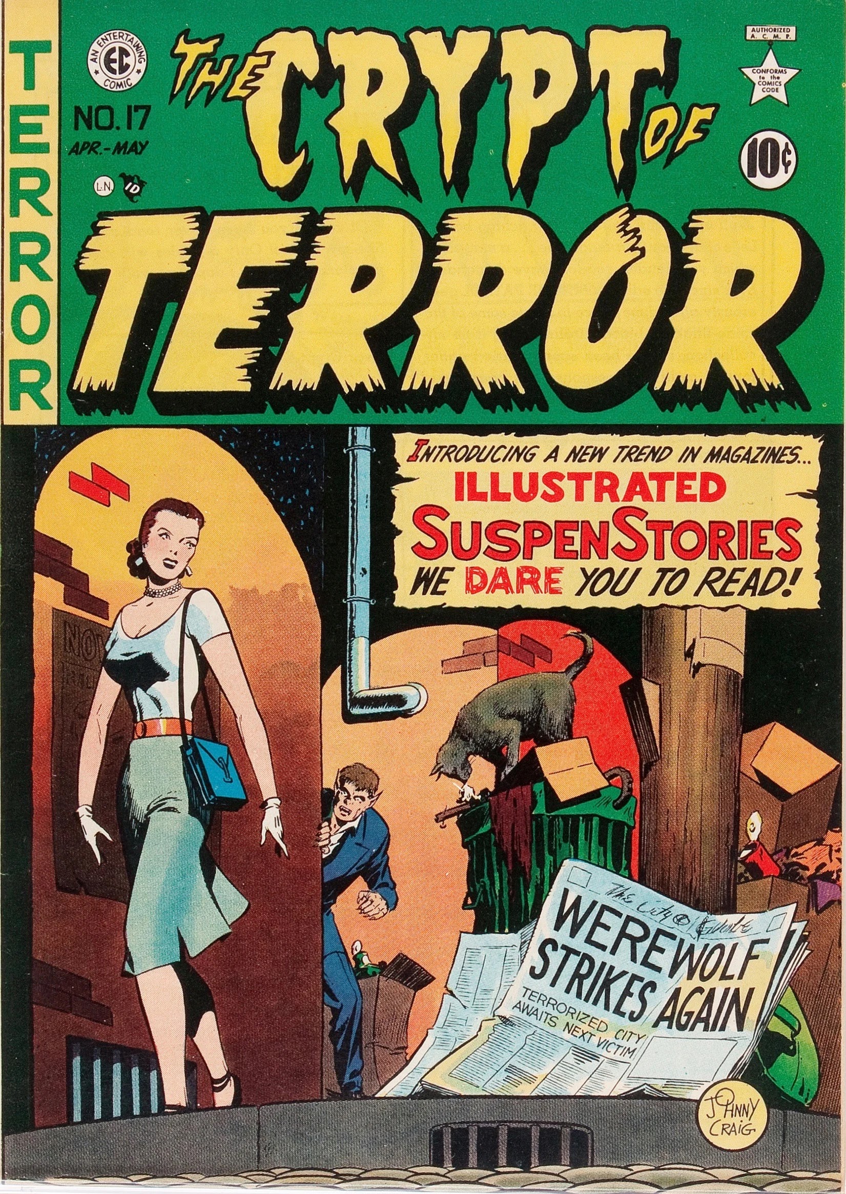
Nel gennaio del 1950 questo editore americano ha lanciato sul mercato The Crypt of Terror e The Vault of Horror, due serie antologiche che presentavano ad ogni numero una manciata di brevi storie del terrore.
I racconti erano a sé stanti, senza alcuna continuity (i fumetti Marvel di Lee/Kirby/Ditko & C. erano ancora al di là da venire) e non formavano una mitologia coerente. Unici trait d'union tra i racconti erano i grotteschi personaggi che comparivano nella prima e nell'ultima vignetta: the Crypt Keeper (il guardiano della cripta), the Old Witch (la vecchia strega) e the Vault Keeper (il guardiano dei sotterranei) che introducevano e commentavano, non senza sarcasmo o ironia, le vicende illustrate.
Anfitrione numero 1
The Crypt of Terror cambiò in seguito il proprio nome in Tales From The Crypt e con questo titolo resterà conosciuta e, come vedremo, onorata (l'esatto numero del cambio di testata non riesco a stabilirlo senza accesso agli albi originali degli anni '50)
Incoraggiato dal successo di queste antologie, Bill Gaines, editore capo, aggiunse nuovi titoli al proprio piano editoriale, come The Haunt of Fear e altre pubblicazioni sullo stesso modello, ma dedicate ad altri generi come la guerra, il crimine o la fantascienza (Two-Fisted Tales, Crime SuspenStories, Weird Science) senza contare quella che poi sarebbe diventata una rivista di culto: MAD - inizialmente chiamata Tales Calculated to Drive You Mad nello stile esuberante del suo ideatore Harvey Kurtzman.
L'insieme di talenti che Bill Gaines fu in grado di riunire fece di queste testate dei veri e propri gioielli editoriali, seppure sotto la guisa di luridi giornaletti di nessun valore; oltre al già citato Kurtzman basti aggiungere Jack Davis, Frank Frazetta, Wally Wood, Johnny Craig o Joe Orlando).
(nota: queste pubblicazioni all'epoca non approdarono mai in Italia, a conoscerle erano sopratutto amanti e storici del fumetto o conoscitori della cultura pop americana. Le prime traduzioni di queste serie sono apparse nel 1990 per le edizioni B.S.D. che però chiuse la collana dopo poche uscite.
I narratori
Non racconterò qui delle fortune e sfortune editoriali della EC (il clima censorio della metà degli anni '50 si tradusse nella chiusura forzata di quasi tutti i titoli delle EC, con l'esclusione dell'umoristico MAD) quello di cui voglio scrivere è la particolarità dell'uso dei "narratori" o anfitrioni in queste storie.
Scusate se la prendo da lontano. Il fatto è che da sempre noi esseri umani amiamo raccontare storie, o farcele raccontare, attorno al fuoco o illuminati dalla luce bluastra della tv in salotto; ancora di più amiamo quando queste storie ci spaventano.
Lo facciamo da così tanto tempo che oramai certi elementi del "racconto di paura", così come certe tecniche retoriche, si sono cristallizzati e codificati.
Alcuni esempi?
- presentare la storia come realmente accaduta
- arrivare a una conclusione sorprendente e inattesa
- la presenza di una lezione morale, spesso esemplificata da un crudele contrappasso che attende per i protagonisti meno virtuosi
- la presenza di un narratore o anfitrione (si vedano ad esempio televisive come Ai Confini della Realtà, Thriller o il programma di Vampira).
Creepy, Eerie e l'editore Warren
Per circa un decennio la fortunata formula di Tales from the Crypt (storie brevi e sorprendenti realizzate dalla crème degli autori di fumetti dell'epoca) non fu replicata.
Il mercato dei comic book nord-americano stava vivendo una trasformazione notevole. Uno dopo l'altro i vari generi come il fumetto rosa, western o di guerra, perdevano popolarità mentre la DC e sopratutto la Marvel fecero rinascere il genere supereroistico con vendite sempre più massicce.
Tuttavia, la crescente egemonia di questo genere finì per lasciare un vuoto per quegli amanti dei fumetti che poco si curavano di avventurieri in calzamaglia.
Ci pensò l'editore Warren con la sua rivista Creepy a raccogliere il testimone di Tales from the Crypt.
Redatta da Russ Jones e successivamente, per un lungo e fortunato periodo, da Archie Goodwin, Creepy nacque nel 1964, sfoggiando in copertina il proprio "parsonaggio narrante", vera e propria mascotte della rivista: Uncle Creepy (solo io sento un'assonanza tra Uncle Creepy e Crypt Keeper?)
Anfitrione numero 2
Nel 1965 Warren affianca a Creepy una rivista gemella: Eerie dove a fare da cerimoniere questa volta è un nuovo personaggio, Cousin Eerie (nome non particolarmente fantasioso, devo ammettere).
Anfitrione numero 3
L'atteggiamento sardonico e l'aspetto tetro dei personaggi è chiaramente una variazione sui vecchi narratori della EC comics. Si potrebbe chiamare un omaggio. Ma come abbiamo detto, l'uso di un tetro narratore per questo tipo di storie è un vero e proprio cliché consolidato.
Dovendo raccontare una storia del terrore, non amiamo anche noi illuminare il nostro viso dal basso e fare una voce gracchiante?
Molti illustri professionisti del mondo del fumetto, come Mark Chiarello, sono convinti che Creepy e Eerie siano state tra le riviste a fumetti di più alto livello mai prodotte, il che non sorprende, visti i nomi degli autori coinvolti: oltre a dei veterani di Tales come Davis o Candrall Reed, si trovano giganti come Alex Toth, Al Williamson o Howard Chaykin.
Creepy e Eerie sembrano anche aver coinciso con una crescente popolarità e rilevanza del genere horror al cinema, si pensi alle pellicole della casa di produzione inglese Hammer, o alla nascita dell'horror italiano che conoscerà una vera e propria fioritura creativa per il decennio seguente.
Così come la cronaca nera e le pubblicazioni scandalistiche, il crimine e l'horror sono sempre stati generi di facile presa, da Diabolik fino a Dylan Dog, passando da Satanik, l'horror o le serie 'nere' hanno conosciuto crescenti picchi di popolarità anche in Italia.
Forse anche per questo Arnoldo Mondadori (editore 'di libri' che però grazie al disneyano Topolino ha ricoperto un importante ruolo come editore di fumetti) decise di proporre in Italia per primo le storie della Warren.
Il 14 luglio 1969 uscì, per la prestigiosa collana Oscar Mondadori, guidata all'epoca da Mario Spagnol, Le Spiacevoli Notti di Zio Tibia (n. 221), seguito da Zio Tibia Colpisce Ancora (n. 305, del 4 luglio 1972) e infine da Mezzanotte con Zio Tibia (Oscar Mondadori n. 401, del 29 maggio 1974).
(quante bestie ha zio tibia -ia -ia -o)
La traduzione del primo volume fu a cura di Lydia Lax, a cui, in assenza di fonti migliori, devo attribuire l'indovinata traduzione di Uncle Creepy in Zio Tibia.
Cousin Eerie invece, per restare in tema 'osseo', diventò Astragalo, come l'osso del piede che si trova proprio sotto la tibia.
Al momento non so dire se tra gli anni '70 e gli anni '90 in Italia, altre storie della Warren possano aver visto luce altrove che nei sopracitati volumi, di cui il primo è stato recentemente ristampato.
Sangue a fiotti
Purtroppo, a perdere sangue tra gli anni '70 e la fine del secolo, più che le vittime degli efferati delitti di carta, fu l'editoria in genere, con una continua emorragia di lettori.
Complice anche un'inflazione galoppante dei costi di stampa, molte iniziative editoriali non sono riuscite a durare molto, nonostante l'Italia fosse e sia tutt'ora un paese dove le tirature fumettistiche restano piuttosto elevate rispetto alla media di altri paesi.
A proporre le store della Warren ci hanno pensato riviste della Max Bunker press, o riviste come L'Eternauta, Comic Art o Horror, almeno finché Eerie e Creepy non hanno chiuso i battenti negli anni '80.
Ma se il fumetto (d'orrore o meno) vedeva diminuire la sua popolarità, l'horror come genere era tutt'altro che defunto.
The Horror Picture Show
Penso di non dire una stupidaggine affermando che il principale motore della super-popolarità dell'horror, a partire dagli anni 80, è stato il cinema (e forse i romanzi di Stephen King?)
Non un grande successo, ma doveroso da menzionare in questo contesto, è Tales from the Crypt, un film a episodi che riproponeva abbastanza fedelmente alcune delle storie dai vecchi EC. Diretto da Freddie Francis (noto anche come spettacolare direttore della fotografia) per la inglese Amicus Production.
Anche qui troviamo un 'crypt keeper' (questo il suo nome nei credits), che però non ricorda fisicamente quello dei fumetti e che nel film non si presenta mai come tale.
Anfitrione numero 4 (risparmiamo sul make-up)
Le cose cominciano a confondersi quando due numi tutelari dell'ascesa dell'horror ci mettono lo zampino: nientepopodimeno che Stephen King e George Romero.
I due infatti uniscono le forze nel 1982 per produrre Creepshow, un film antologico nella stessa vena di Tales from the Crypt e dichiaratissimo omaggio ai fumetti EC.
Anche in questo film non si rinuncia a un dispositivo-cornice a fare da collante tra i diversi episodi del film e anche qui incontriamo un narratore: The Creep, che compare dapprima sotto forma di pupazzo (a dire il vero assai poco mobile) per poi trasformarsi in un cartone animato.
Anfitrione numero 5
E quando l'estro "traduttivo" italiano ci si mette di mezzo ecco che the Creep (parola intraducibile che vuol dire allo stesso tempo qualcuno di sinistro, sospetto, strambo ma anche sfigato) diventa Zio Creepy, dunque di fatto un omonimo del personaggio della Warren.
Nel sequel Creepshow 2 (1987) il personaggio sarà interpretato da un irriconoscibile Tom Savini in uno dei suoi efficaci make-up.
Nel corso degli anni '80 film come A Nightmare on Elm Street o Venerdì 13, oltre a generare lunghe liste di sequel, diventano film popolari non solo tra gli appassionati del genere, ma veri e propri fenomeni di cultura pop. Dylan Dog (in controtendenza con il resto dell'editoria di fumetti) vede aumentare la propria tiratura numero dopo numero.
E proprio per assecondare l'arrivo dell'horror nella cultura mainstream, nel 1989, sull'emittente Italia 1 (proprietà di Silvio Berlusconi) debutta Zio Tibia, una trasmissione contenitore per film o telefilm dell'orrore.
Negli intermezzi prima dei film o tra le interruzioni pubblicitarie, questo pupazzone (animato maluccio, tra l'altro) si produce in una serie di freddure e giochi di parole che uniscono l'orrido alla commedia. Difficile capire se si tratti di un mero "omaggio" alla controparte fumettistica (ha un aspetto decisamente diverso) da cui prende in prestito il nome, o se invece sia inteso come un "adattamento ufficiale" del personaggio della Warren.
E non è solo, a fare da spalla anche un secondo pupazzo, chiamato Astragalo, proprio come Cousin Eerie nella sua versione italiana (ma anche qui: il nome è l'unica somiglianza)
A dire il vero la formula ricorda più che altro il già citato show di Vampira.
Anfitrioni numero 6 e 7
Vien da chiedersi se Italia 1 o i produttori del programma abbiano pagato i diritti per l'uso dei personaggi, o se forse non sia servito, giacché gli autori hanno fatto solo uso dei nomi italiani, così come tradotti da Mondadori (nel frattempo divenuta di Berlusconi anch'essa).
Ad ogni modo, sorvolando sulla qualità di questi interstiziali o sulla liceità nell'uso dei nomi (sull'utilizzo della formula c'è poco da dire, come abbiamo visto è un punto fermo del genere) questo è il programma grazie al quale ho fatto la mia personale conoscenza con Zio Tibia.
Ma la cosa più curiosa è il coincidere dell'apparizione italiana di Zio Tibia con il lancio di una trasmissione americana, solo un mese prima: il 10 giugno 1989 sul canale via cavo HBO, è andato in onda il primo episodio di una serie horror. Non una trasmissione contenitore, ma una vera e propria serie TV. Antologica. Si chiama Tales From the Crypt.
E ad aprire ogni puntata ci pensa un narratore.
Un narratore pupazzo:
The Crypt Keeper.
Anfitrione numero 8
Come già per l'omonimo film di Freddie Francis, molti episodi della serie sono adattamenti di storie pubblicate dalla EC.
La contemporaneità della serie americana con il programma interstiziale su Italia 1 potrebbe benissimo essere stata una coincidenza: come già osservato, l'horror ha conosciuto una continua crescita di popolarità per tutti gli anni '80.
Solo che quando la serie HBO arriva in Italia, Crypt Keeper prende il nome di... Zio Tibia.
È possibile che chi ha tradotto la serie non sapesse distinguere tra i due personaggi, oppure che abbia voluto creare una continuità laddove non c'era per sfruttare il possibile ricordo che il pubblico italiano aveva con il personaggio della Warren e di Italia 1...
E così, per lo meno in Italia, i due personaggi sono diventati essenzialmente la stessa cosa.
Niente per cui strapparsi le vesti, per carità, ci sono destini peggiori, ma per lo storico che cerca di mettere le cose in fila si tratta di una piccolo garbuglio che sono contento di essere riuscito a sciogliere.
Altre letture raccomandate:




.jpg)
.jpg)